Digital Product Design
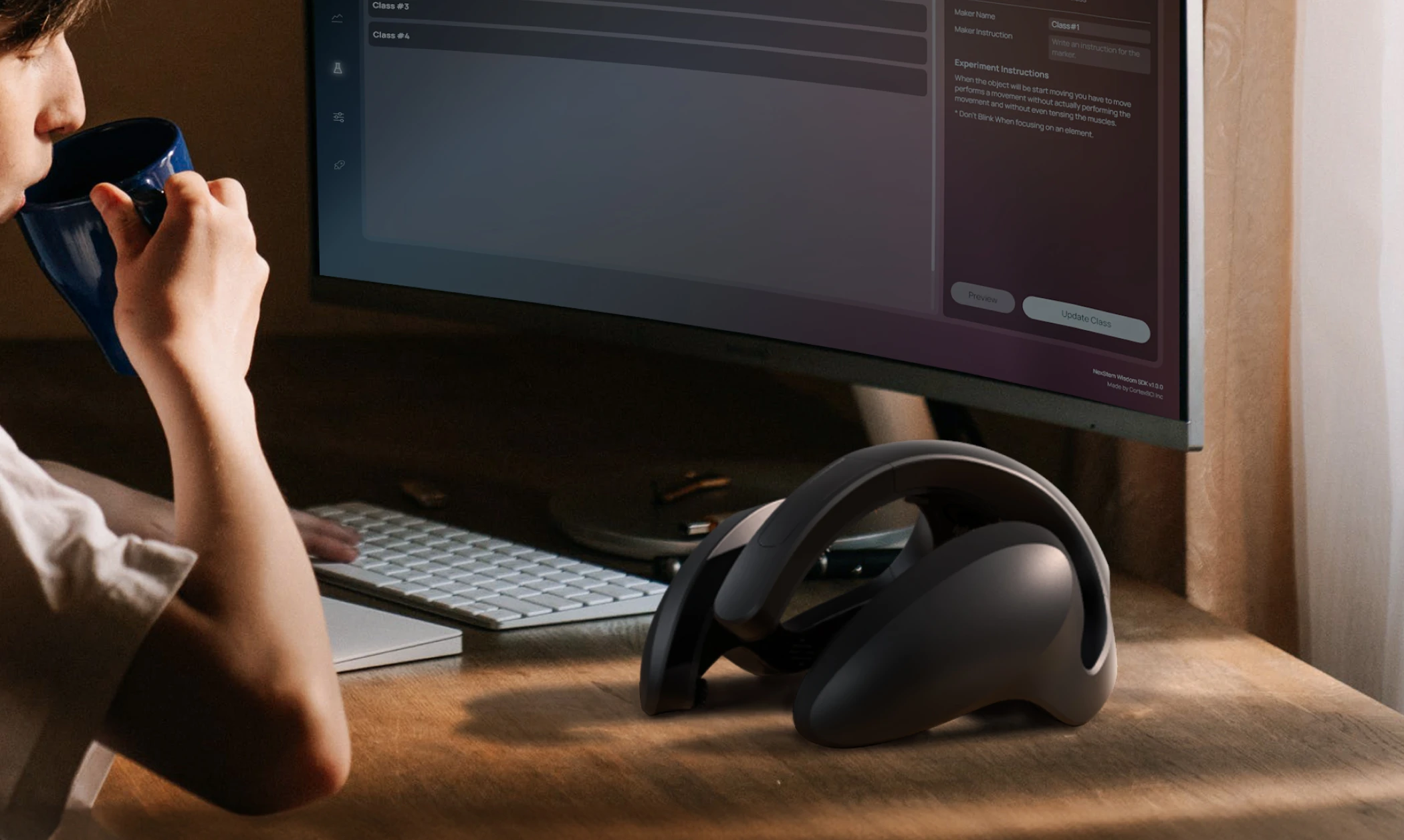
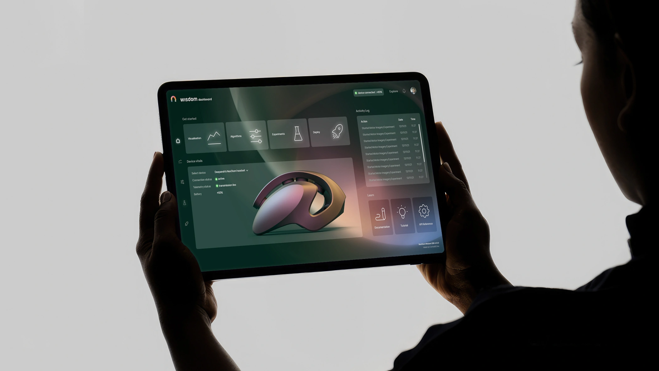
Digital products often fail experientially. A confusing flow, an unclear dashboard, a feature that cannot be found. These are design problems. We solve them through research, information architecture, design systems and prototypes, before a single line of code is written. And when development begins, we make sure the product comes to life as intended.
Complexity made simple to view, and delightful to use
Every digital product is a promise. A promise that the user will find what they're looking for, understand what they're seeing, and finish what they came to do. When that promise breaks, users leave and don't return. Our job is to design that promise into every screen, every flow, every interaction, from the first discovery session to the final design handoff.
Every project starts with a conversation. Before we touch a wireframe or write a line of code, we sit down with founders and product teams and ask the questions most agencies skip: Who is this actually for? What problem does it solve? What does success look like six months after launch? The answers to those questions shape every decision that comes after.
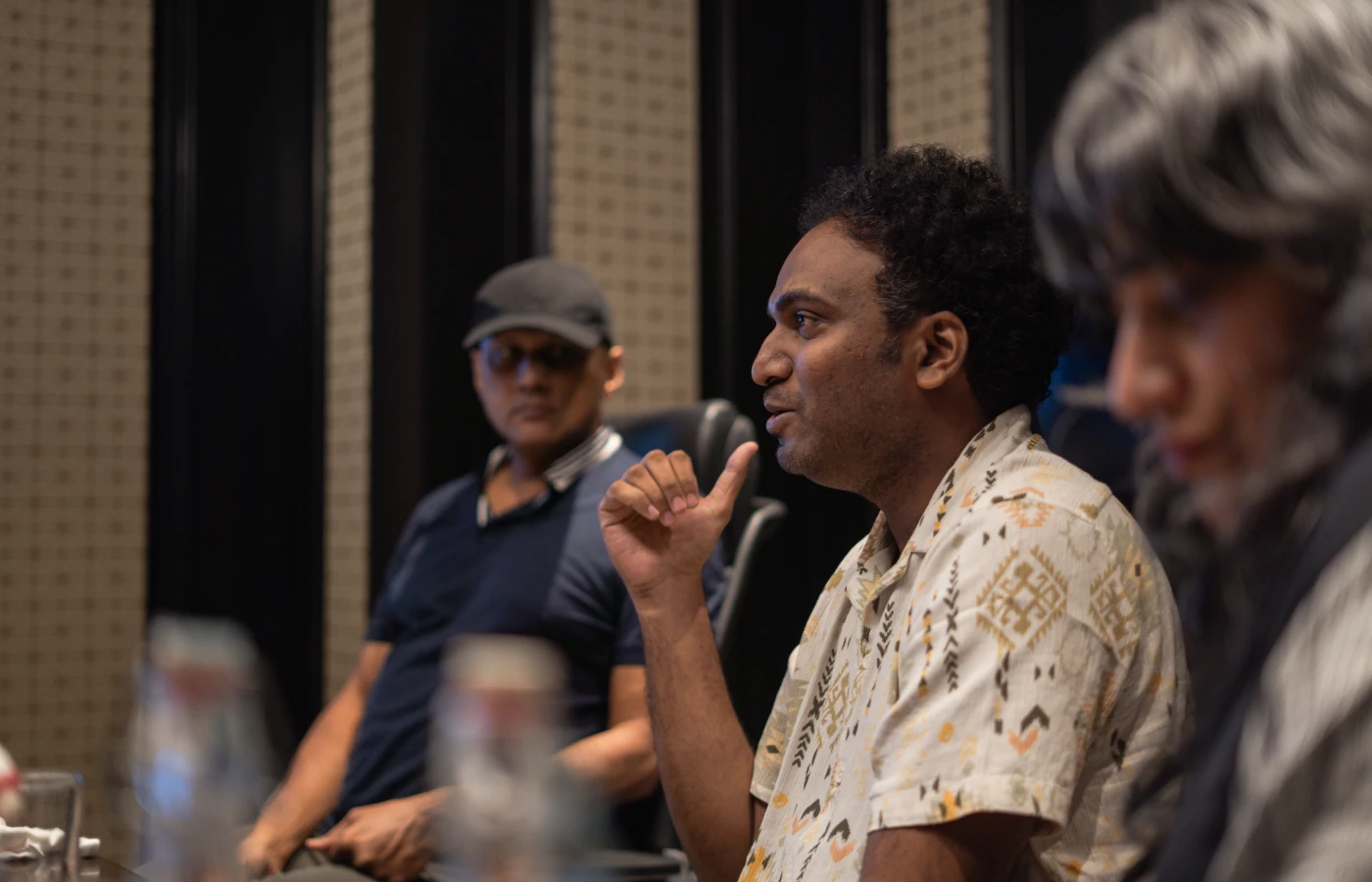
Once the vision is locked, we figure out what actually gets built first. Not every idea makes it into the first build, and that's by design. We prioritize ruthlessly, then map the product's architecture: its sections, functionality groups, and how a user moves through all of it. This is the skeleton before the skeleton.

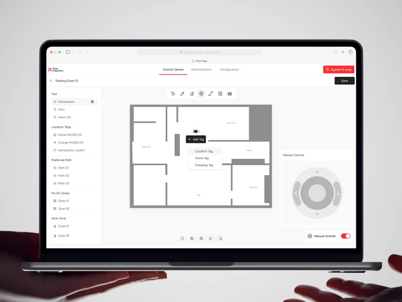
Here, we build the blueprint. We design the structure of every screen, including the layout, where the content goes, what a user sees first, and where they go next. No visual design yet. Only structural decisions. This is where we answer the question that nobody bothers to ask and yet, kills most products: does this actually make sense?

Once the structure is solid, we move into visual design. That means establishing the colour palette, typography, surface treatments, and other graphical elements, all tied to how the brand needs to show up. We typically explore multiple distinct directions, then test them against real-world scenarios before narrowing down. By the end, it’s usually obvious which one works.

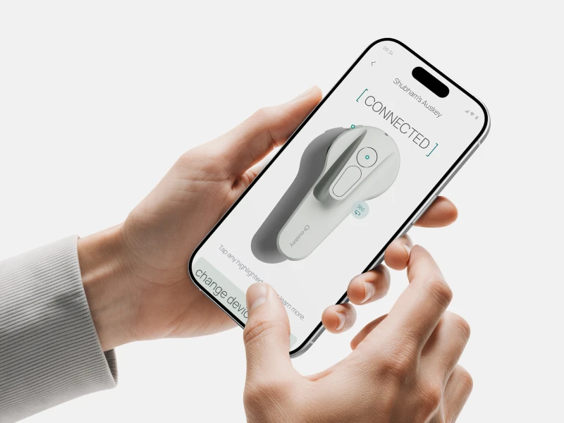
This is where everything we detailed in the wireframes and visual concept becomes real. We design every screen, every state, and every edge case to the same high standard. Accessibility and UI guidelines are worked into the designs from day one. Copy goes directly into the Figma file. This is when you begin to see the final state of the product.
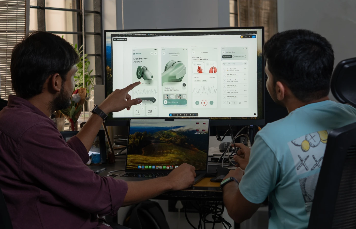
Most screens ship with motion as an afterthought. We treat it as part of the design from the start: a set of principles that govern how gestures respond, how transitions move, and how the product behaves during loading states. We consider the actual conventions of iOS and Android as well. This step is what makes a UI design feel like a delightful experience.

Before anything goes to the development team, we review the designs for technical feasibility, flagging anything that would add significant time or cost while proposing practical alternatives. We remain involved with the development team throughout the build, making sure what was designed is what gets shipped.

Get In Touch

Jitesh Devadiga
UX (user experience) design, is about how a product works. It covers research, information architecture, user flows, and interaction logic. UI (user interface) design, is about how it looks and feels: typography, colour, components, visual hierarchy. In practice, the two are inseparable. A beautiful interface with poor logic frustrates users. A well-structured flow with weak visual design loses their interest. We prioritize both equally.
We specialize strictly in design. We do not develop. But we ensure every handoff is build-ready. Technical feasibility is integrated throughout our design process, and our documentation is sufficiently detailed for any capable development team to build directly. If your project requires additional development support, we can help you identify the right partner for the build.
Yes. We start with a UX audit of the existing product: where users drop off, where the logic breaks down, where the interface creates friction. From there we recommend what needs to change and what should stay. A redesign isn't always a rebuild. Sometimes the structure is sound and only the surface needs rethinking. We'll tell you which is which.
We test it. Depending on the stage and scope, this ranges from internal heuristic reviews and usability walkthroughs to moderated sessions with your actual users. Validation is built into the design process, not bolted on at the end. If something isn't working, we'd rather find out before it reaches anyone.
High-fidelity Figma files complete with all necessary components and annotated handoff documentation. For longer projects, we can build a comprehensive design system, ensuring your developers achieve near one-to-one design-to-code parity. For leaner engagements, a UI style guide that establishes a formal visual system for the product. Either way, you leave with something your team can own, extend, and build on.