Peer Robotics
Peer Robotics builds autonomous mobile robots that move materials across factory floors and learn their routes from the people working beside them. The software to command a fleet of them already existed. A proof of concept, dense with capability, built by engineers for engineers. The task for us was to rebuild it for the actual users. Shop floor operators with little time to space and no appetite for decoding a robot's inner workings.
Peer had spent years focussing on capability. Mapping, fleet control, safety zones, error recovery. But none of it had been shaped as an experience. Our brief was to take that depth and make it feel like nothing. The person who opens this app is not a technologist. They're managing machines on a busy floor, with limited attention and no time for a learning curve.
We started with the robots themselves, working closely with Peer's technology team. These machines need a live industrial environment to run. So we sat with the engineers to understand every state, behaviour, and edge case a fleet could throw at an operator. Direct user access was limited too, so we leaned on Rishabh, the founder, who was in constant contact with the floor and carried a sharp read on what operators actually needed.
From there, the work was reduction. The app had to run on a desktop and on a tablet an operator could pull off the robot and carry. The same system, adapting to each screen, surfacing only what mattered in the moment.
The Red Alert
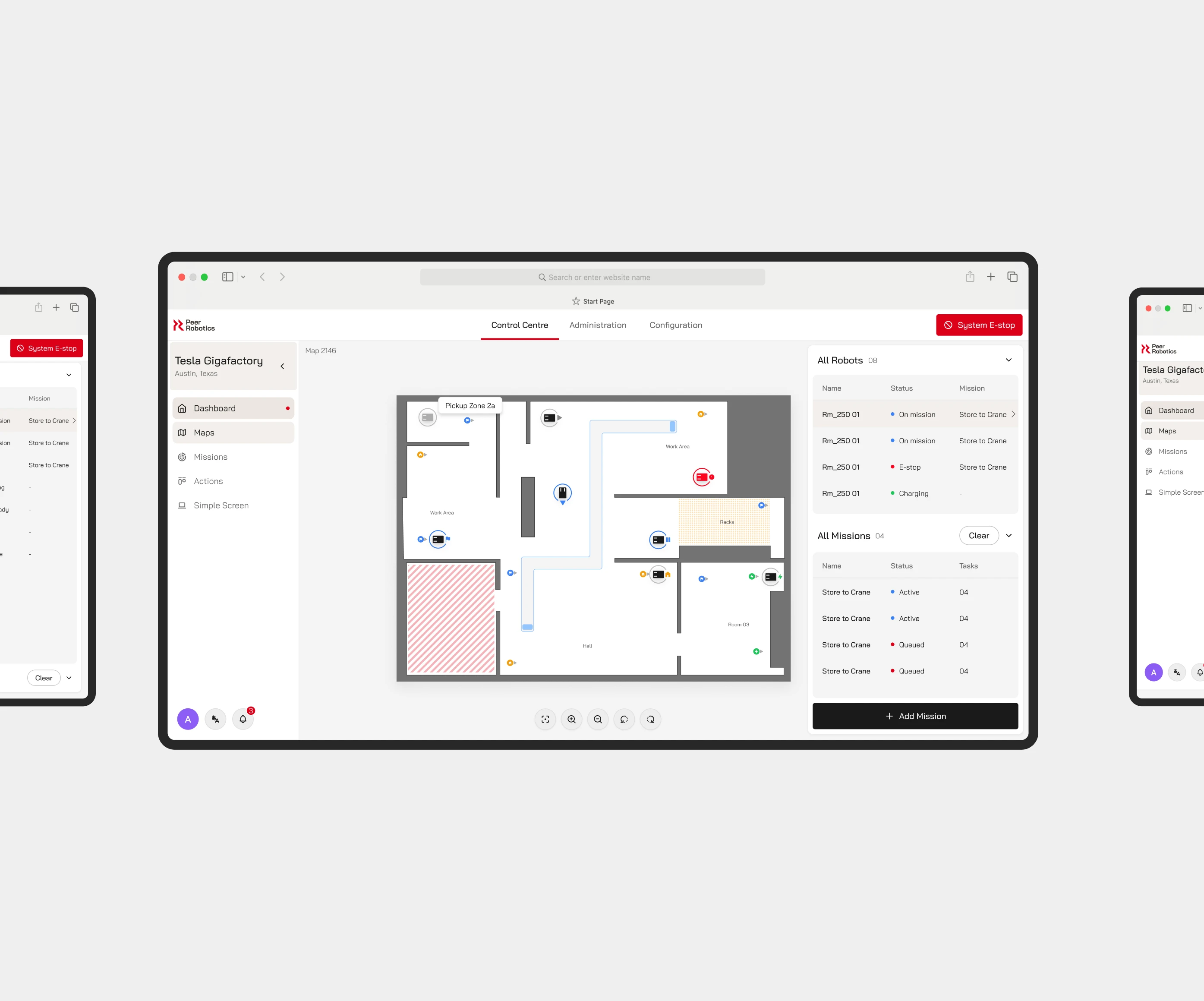
Peer's brand colour is red, and in an interface, red already means something: error, stop, danger. Using it as an accent could have been a trap. Instead we let it play both parts, carrying error and emergency states where the meaning is real, and marking the primary action on any screen where nothing should be missed. We built the rest of the system on the brand's warmer tones, achieving an identity that looks like nothing else in the category.
.webp)
Designing an Interface system
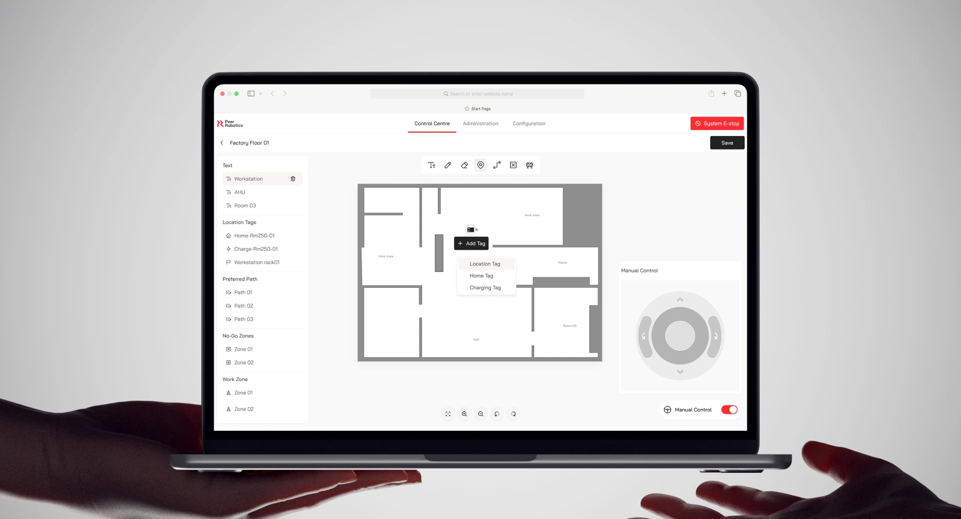
The most useful thing we built may be the thing we left unfinished. In addition to a fixed dashboard interface, our team also designed a kit of components for creating custom interfaces. This could be used by any user to create custom screens for simple actions such as sending a robot to its charging station.
.webp)
.webp)
Mapping the Floor
The robots build their own map of the factory as they move through it. Our job was to make that map legible for operators that reads at a glance. We worked through a lot of versions before landing on one that stays simple without hiding information. A technician glancing at it mid-task should know where everything is, and where the robot isn't allowed to go, before they've consciously read a thing.
.webp)
Reducing Cognitive Load
Every setting and workflow used to live in one long list down the left panel. We grouped them into three: Control Center, Administration, Configuration. Control Center is everything to do with driving robots and fleets; Administration holds the admin-level settings; Configuration handles the specific properties and behaviours of individual robots. Most operators only ever need the Control Center. So the moment they open the app, the noise falls away and the thing they came to do is right in front of them.
.webp)
Impact
The app is live now, running on real floors with real robots. It commands Peer's collaborative robots, the same line as the PEER 3000, which recently won a Red Dot for its design. Peer's engineers took the component system ahead, making it even more customizable. Floor operators today use Peer’s robots to move entire fleets through a factory without stopping to think about the software in their hands. For us, that was always the success metric.
.webp)
.webp)
Jitesh
Project Lead
Aditya Agarwal
Product Designer & UI Designer
Mallika
UX Designer
Shrey
Map Visualisation
Pavan
Product Visualisation
Rishabh Agarwal
Founder & CEO
Ritwik Agarwal
Advisor
Ajay Jarhad
Engineer, Development Team