People Ventures
QARI had spent two decades serving immigrants in Quincy, Massachusetts. Wutabon grew out of that work, connecting immigrant employees directly with employers. Both kept growing past what either could support alone, and by 2023 that growth needed a bigger platform behind it. People Ventures was built to be that platform, giving NGOs the strategy, administration, and resources most nonprofits never have the bandwidth to build themselves. What it didn't have yet was an identity to carry that ambition.
The project ran close to six months, covering the brand's ethos, name, logo, color, typography, and graphic elements, alongside a business strategy to help People Ventures grow into a clearer structure. We had never worked with an NGO before, so we spent the first six weeks just on research, nearly 9500 data points gathered, 240 minutes of interviews with NGO founders across the US, Africa, and Asia, and 850 immigration statistics studied to understand what the community actually needed. We also looked closely at five competitor organizations to see what already existed in the space.
That research led to one idea that shaped everything after it: People Ventures could work like the AWS of the NGO world, a platform other organizations build on top of, rather than one more standalone service. From there we built a strategy around what made People Ventures genuinely different, not the usual playbook other nonprofits follow.
The Ventures of the Job Market
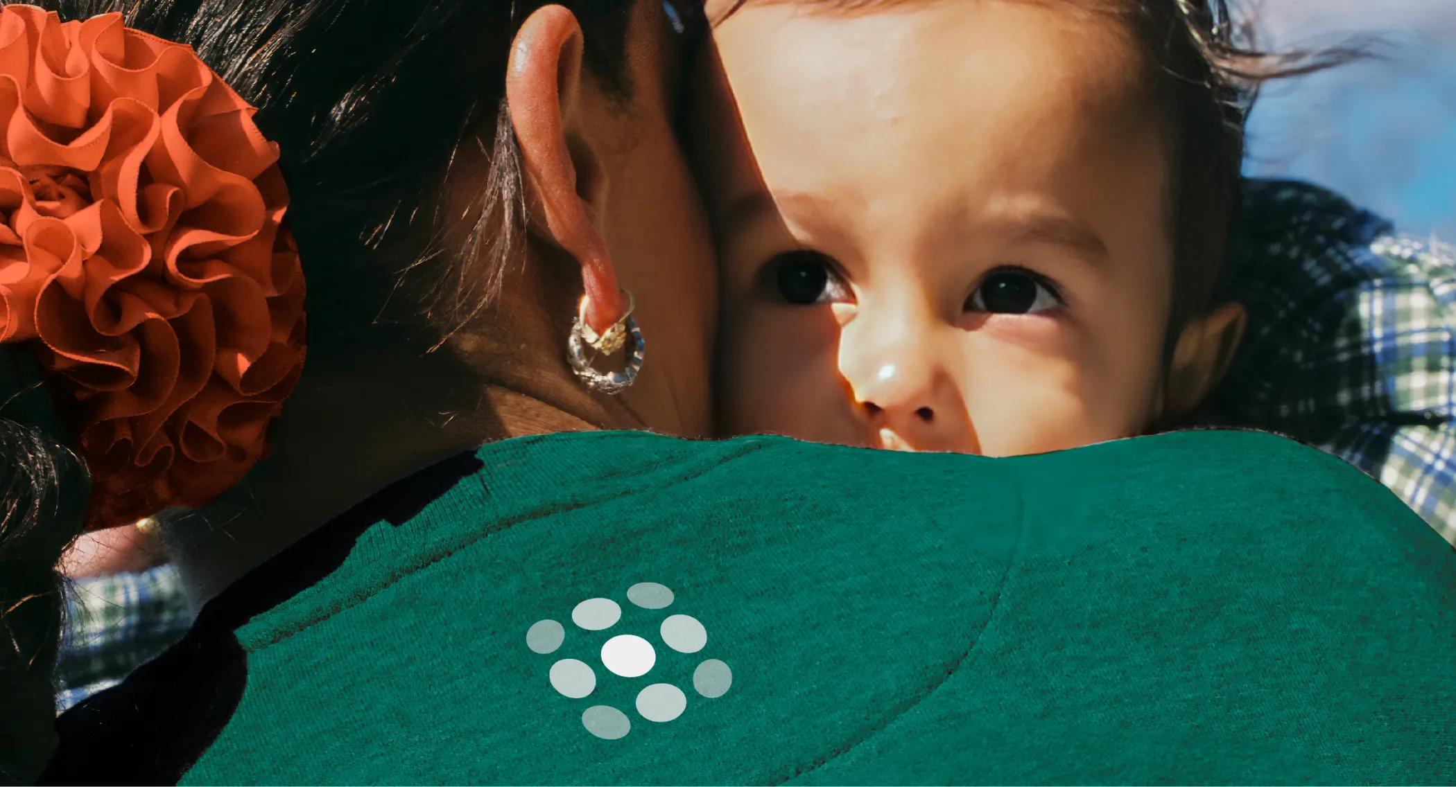
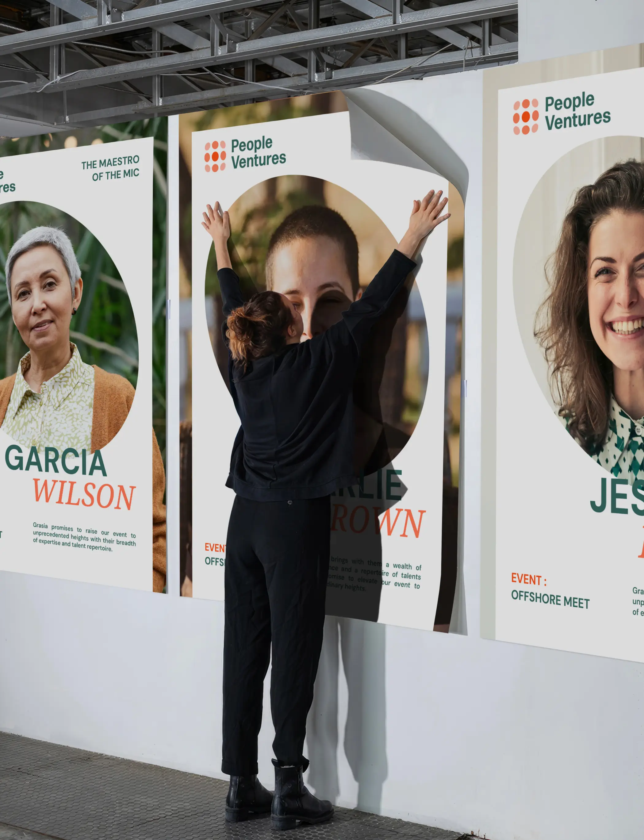
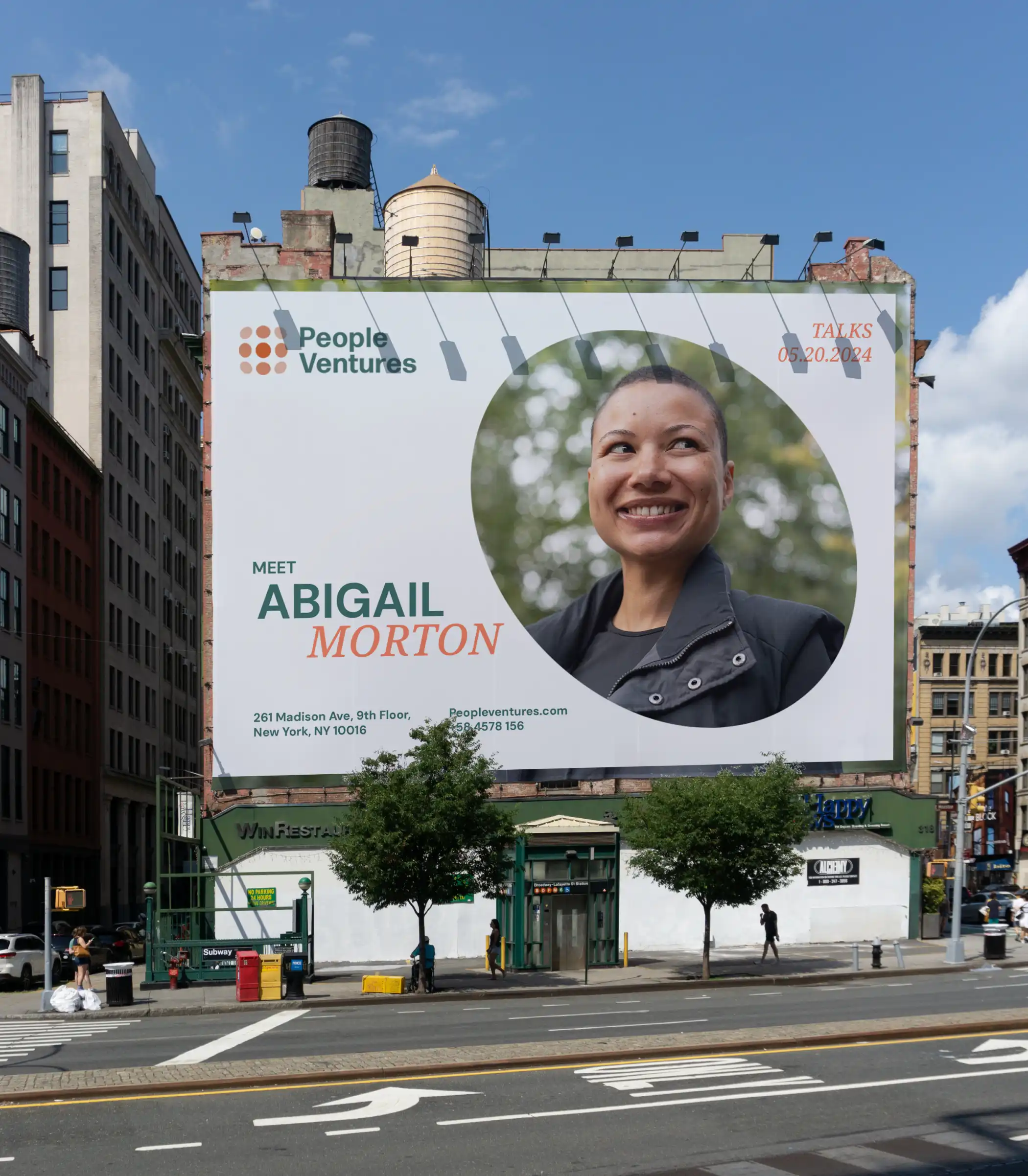
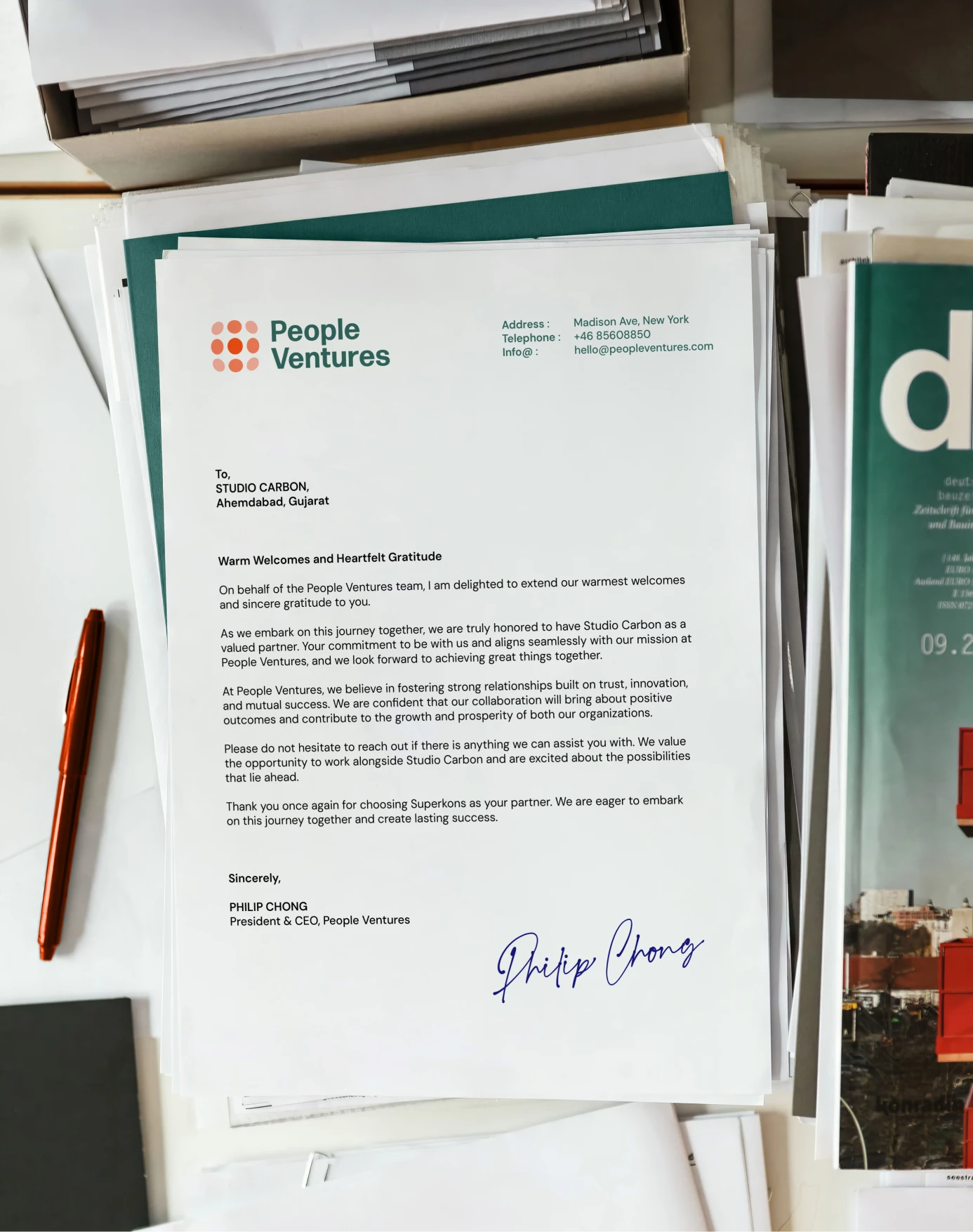
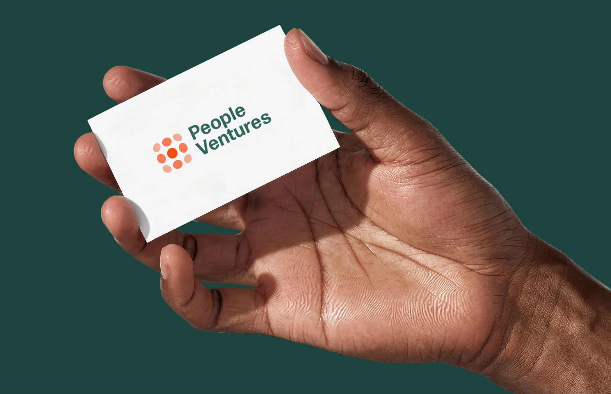
The name carries the idea directly. People Ventures positions the organization as an investor in people, borrowing language usually reserved for startups and money. The logo follows the same thought, a nine dot formation built around the idea of an epicentre, a single point where impact begins and moves outward. Look at it another way and the same dots read as growth, or as people standing together seen from above, three ideas living inside one simple mark.
.webp)

Not Your Usual Nonprofit
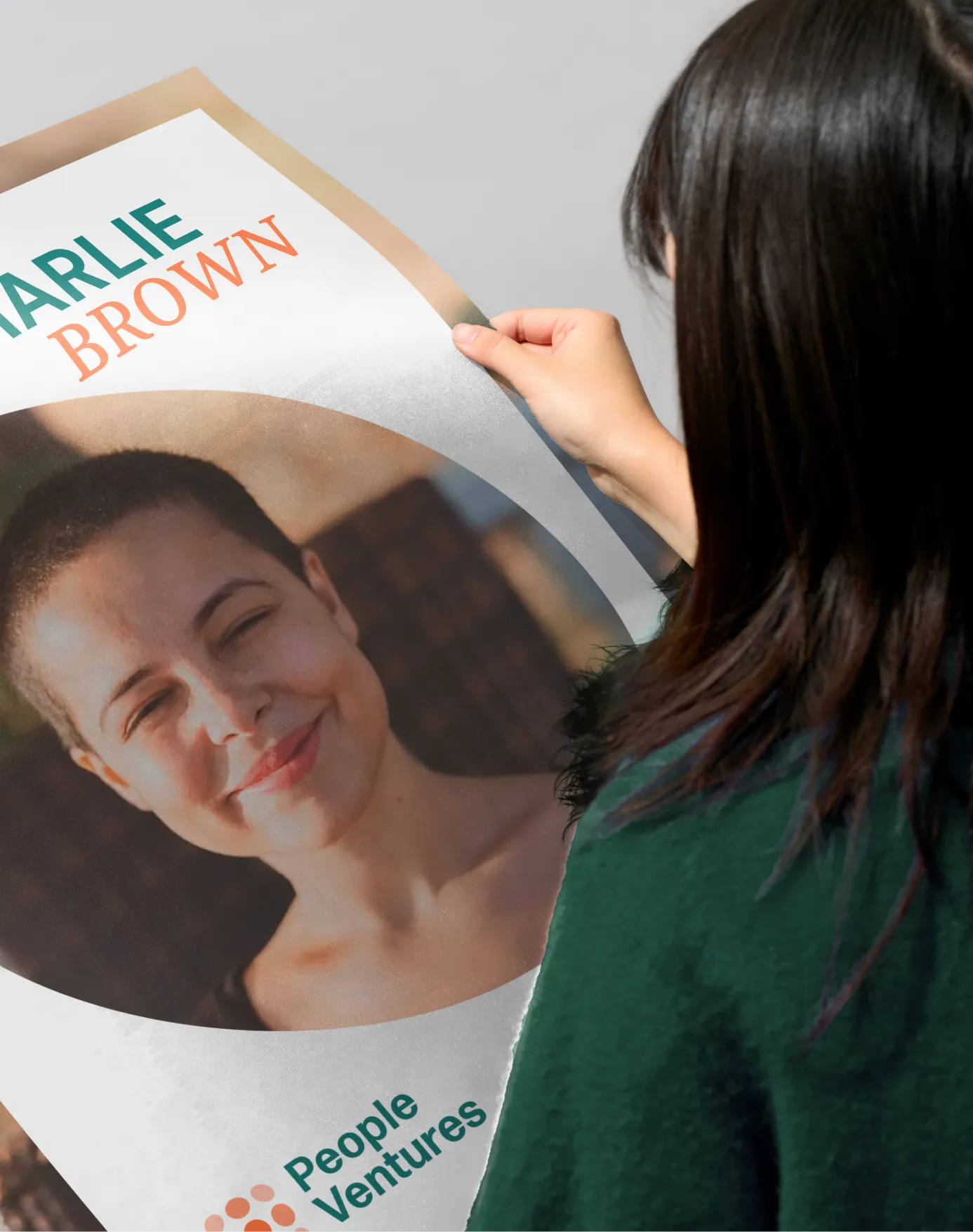
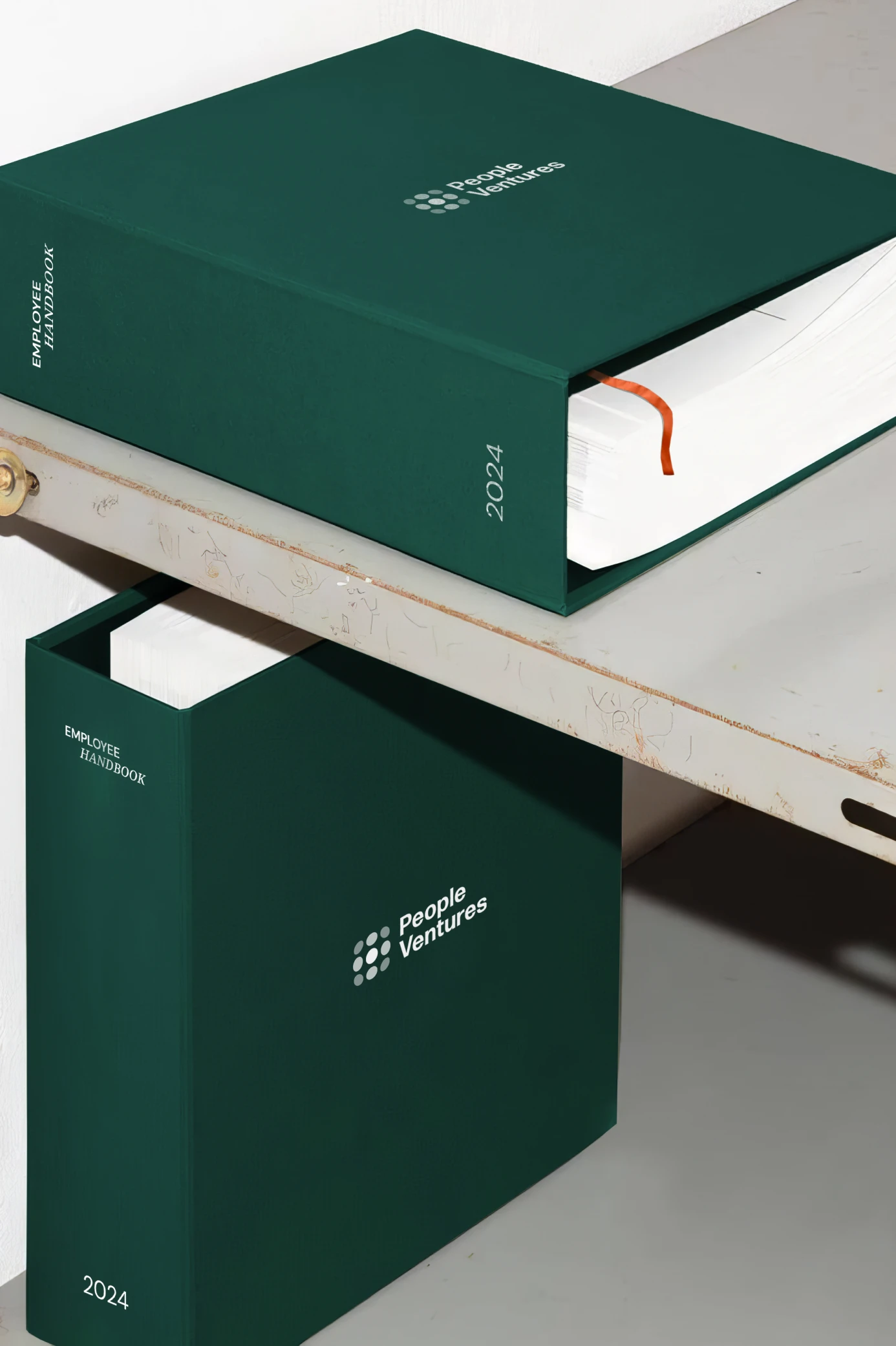
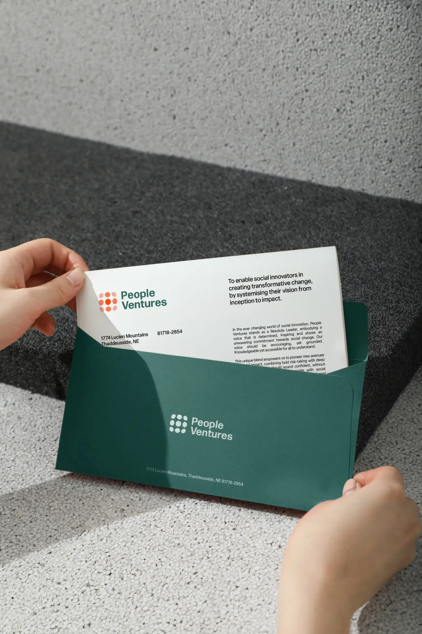
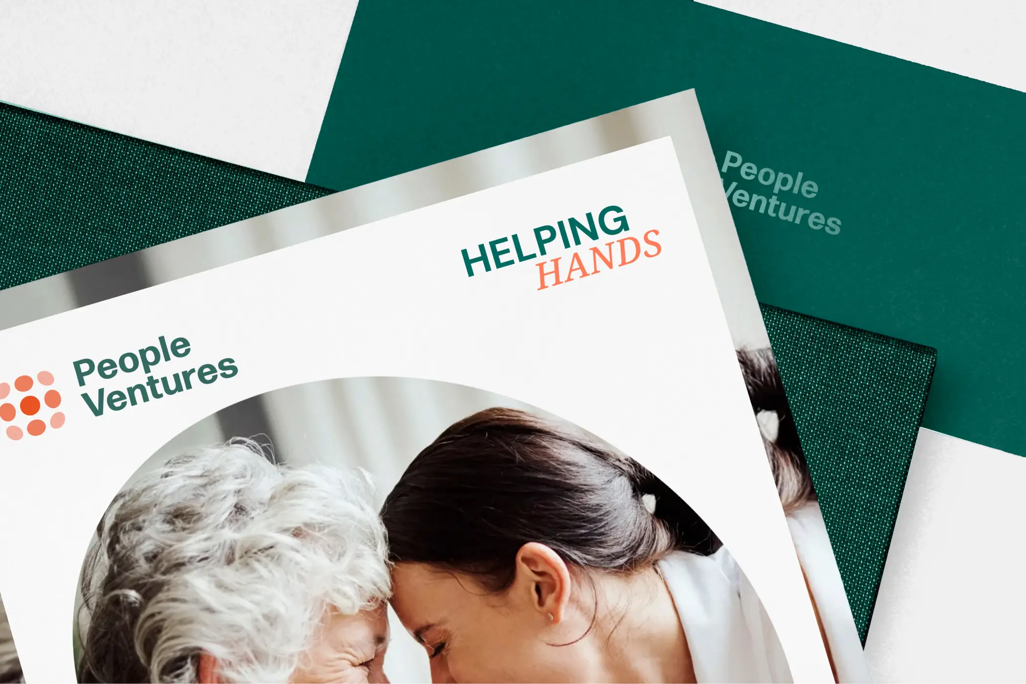
The real challenge behind the visual work wasn't visual at all. People Ventures needed to stop looking like a typical nonprofit without losing anything that actually made it one, more like a startup's energy applied to a mission driven group. That thinking shaped the strategy we built alongside the identity, a plan for how the organization could grow, train its own people, and run with the same discipline any growing company would.

A Voice for Two Audiences
People Ventures needed a voice that could sound confident to investors and comforting to the immigrants it served, without contradicting itself between the two. We landed on an archetype pairing that let the brand sound bold and knowledgeable in the same breath, and defined the resulting persona as a determined, grounded, and hopeful leader without tipping into naivety. Hope became a deliberate tool in that voice, not vague optimism but a practical promise.
.webp)
A Brand That Builds Itself
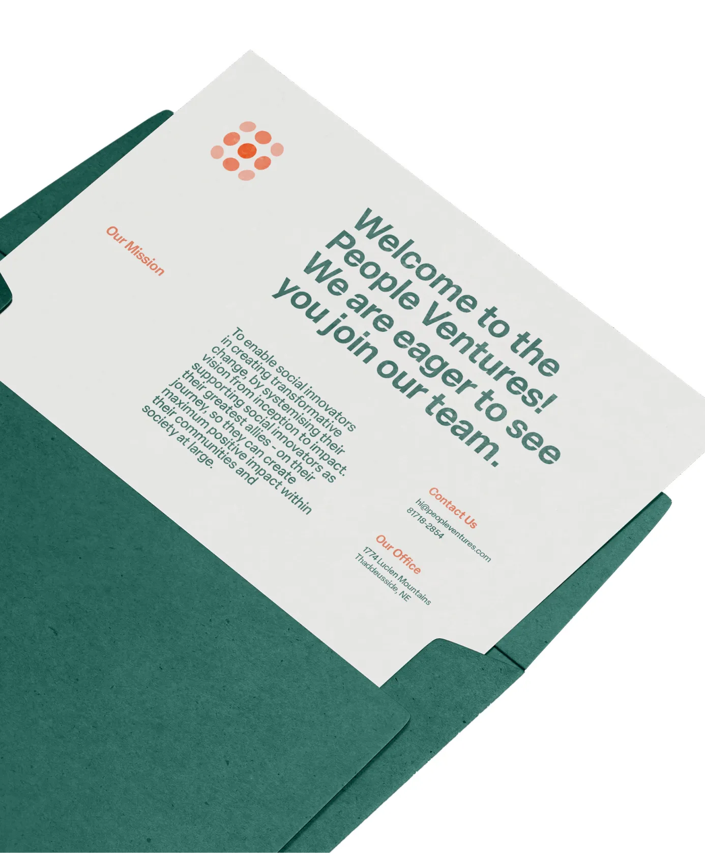
One part of this project had no real precedent for us. Instead of leaving People Ventures with a fixed set of guidelines, we built them a custom AI tool trained on their own brand, so the team could keep writing new brand material on their own long after our work ended. It was the first time we tried this, treating the brand as something the client could keep using, not something that just stopped the day we handed it over.

.webp)
.webp)
For Every Reader
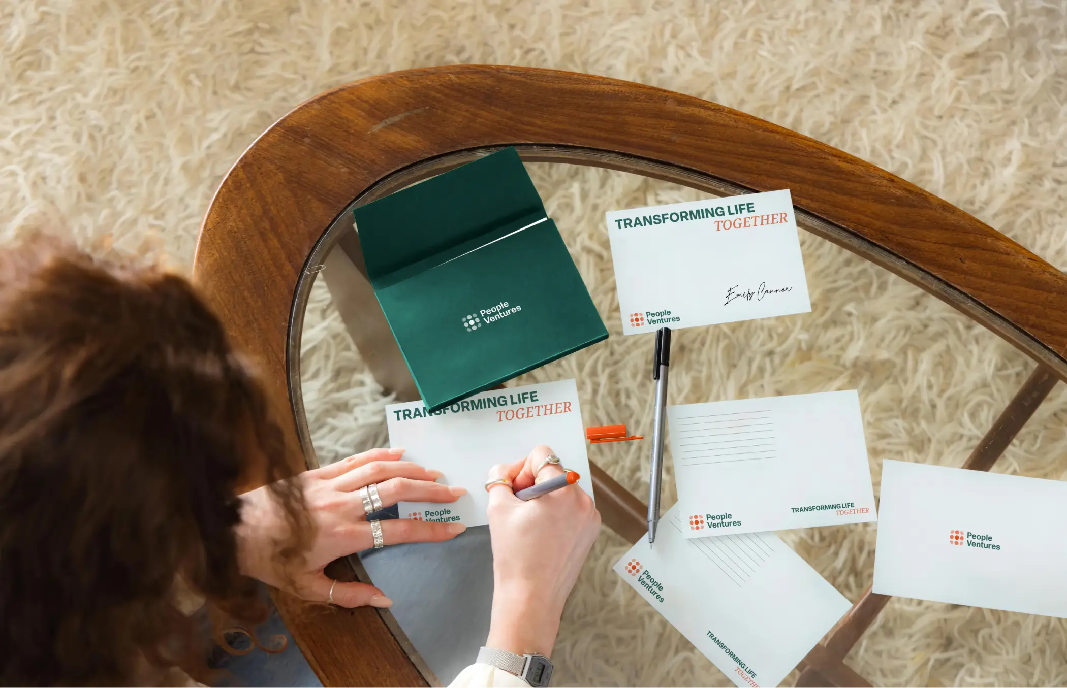
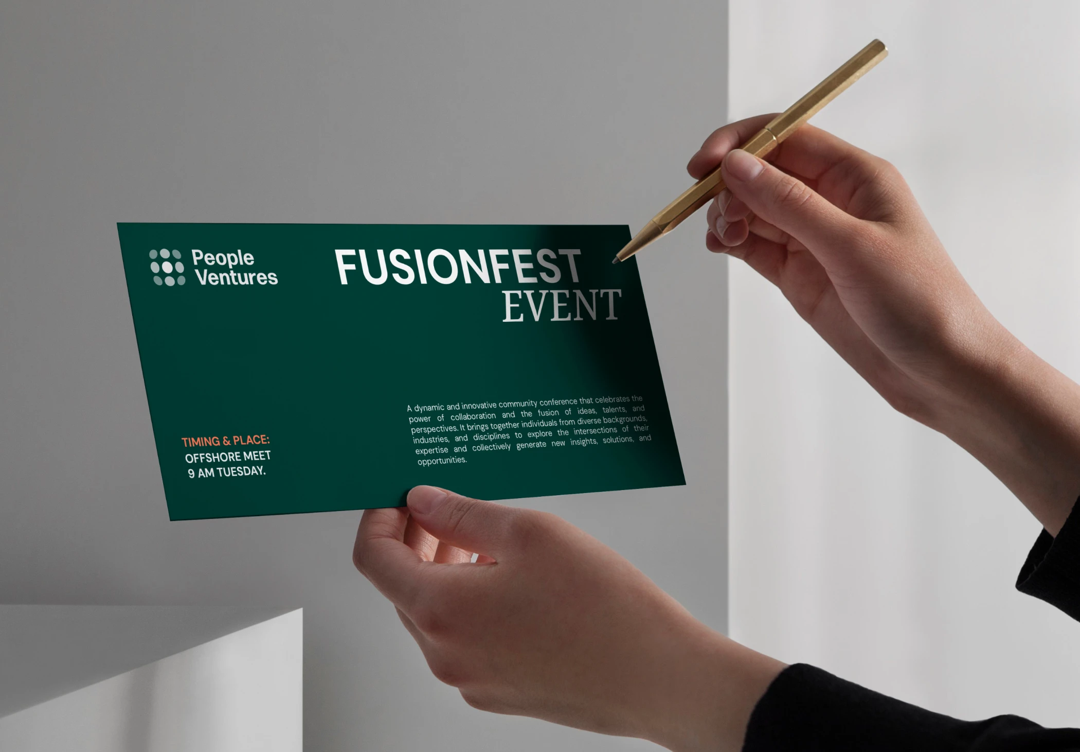
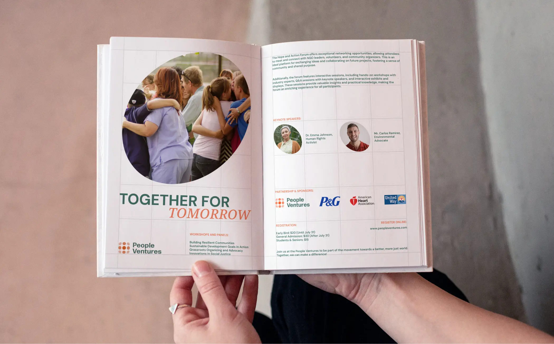
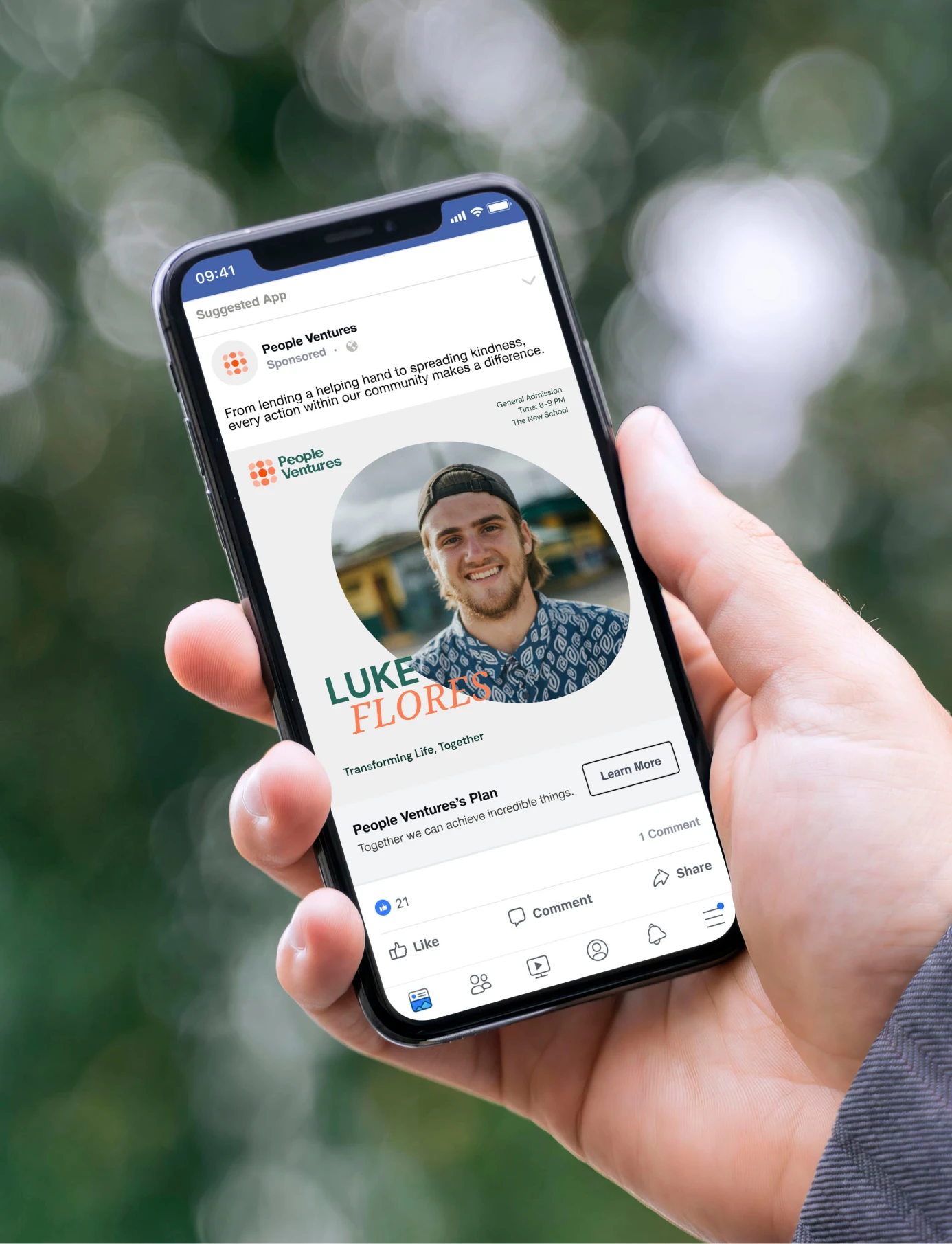
People Ventures speaks to a lot of different people at once, immigrants figuring out a new country, donors deciding who to trust, and partner organizations deciding who to work with. A design that only worked for one of those groups would have failed the rest. So we kept things clear and clean rather than clever, favoring warmth and readability over anything that might feel exclusive or hard to follow.


Impact
People Ventures walked away with a name and a logo that describe exactly what it does, a strategy that lets it grow like a company while staying true to its mission, and a voice that speaks to donors and immigrants alike without losing either one. What started as a request for branding became something closer to a foundation, something People Ventures could keep standing on long after the project ended. People Ventures came back to us for QARI and Wutabon, the brands born out of the same parent organization, a sign the identity held up well enough to build on.

Itika Gupta
Brand & Strategy
Gonga Naveen Kumar
Brand & Strategy
Atreyi Balasubramaniam
Visual Communication Design
Naveen Saini
Visual Communication Design
Philip Chong
President & CEO
Emily Canner
Chief Operating Officer (COO)
Dottie Murphy
Chief People Officer (CPO)