Musclemind
Why should a workout outfit stop working the moment the workout ends? That question sits at the center of Musclemind, an activeleisure brand positioning itself as the first to treat that category as its own. They came to us in 2025 already knowing what they wanted to be, missing only an identity that moved the same way the product did. So that was the job, to build a brand as flexible as the clothes themselves.
Musclemind's customer does not think in separate wardrobes. The same person sweating through a set at the gym is, a few hours later, on the couch or out grabbing groceries in the same clothes, and the product had been built around that person from the start. Our job was making the identity keep pace with that same logic.
The scope covered what a growing brand needs to hold together, an ethos behind every decision, a logo built to carry it visually, a color system, a typography and shape language, and collateral built to prove the identity could travel past a screen. We started with what already existed rather than discarding it. Musclemind arrived with a lion mark that had the right instinct behind it, so the early work was less about invention and more about sharpening what was there and building around it. Every piece that followed, the icon system, the palette, the type, had to follow the same path.
.webp)
Sharpening a Mark That Already Roared
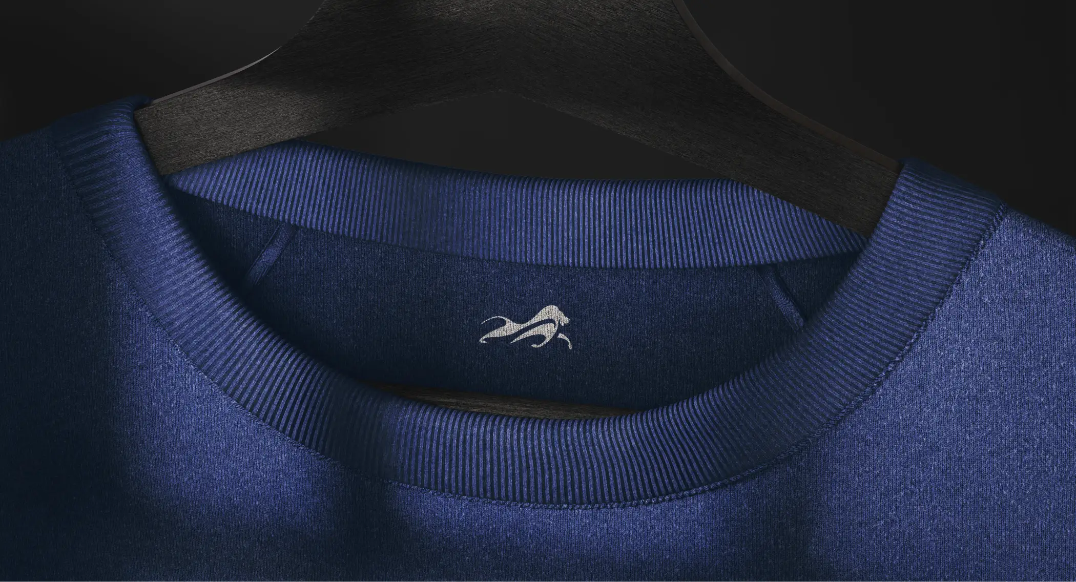
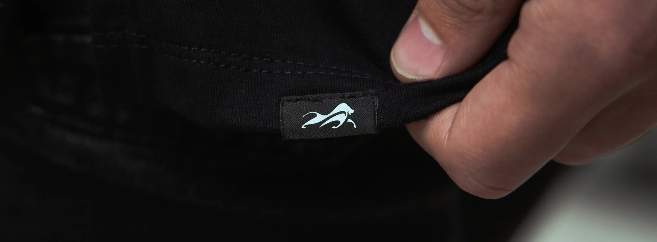
When we met Musclemind, the logo was already a lion, and the instinct behind that was right. What it needed was precision. We rebalanced the form and sharpened the stance, keeping the negative space inside the silhouette, the detail that hints at the seamless transition Musclemind actually sells, moving from a gym floor to everyday life without missing a step. Around it, we built a custom wordmark carrying the same energy.


Three Colors, One Rhythm
Musclemind's palette was built to mirror the life its customers actually live. Active Orange carries the burst of a workout. Leisure Blue is the cooldown after. Core Black holds the two together, disciplined and grounded. None of the three works alone. The same way a gym session and a weekend off are only half a story without the other.
A Vocabulary of Its Own
A logo alone cannot carry a brand across every layout it will ever meet. We developed a set of geometric, structured icons to sit alongside the lion, subtle enough not to compete with it, distinct enough to be recognised on their own. They give Musclemind a visual vocabulary beyond the mark itself.



Type With a Pulse
For type, we chose Parabolica, clean and confident enough to hold a bold headline, legible enough to survive motion and small print. Paired with a system of geometric, ambient shapes, it gave Musclemind a visual language that reads as dynamic as the people wearing the brand, present in a headline as much as in the smallest print.



Across Every Surface
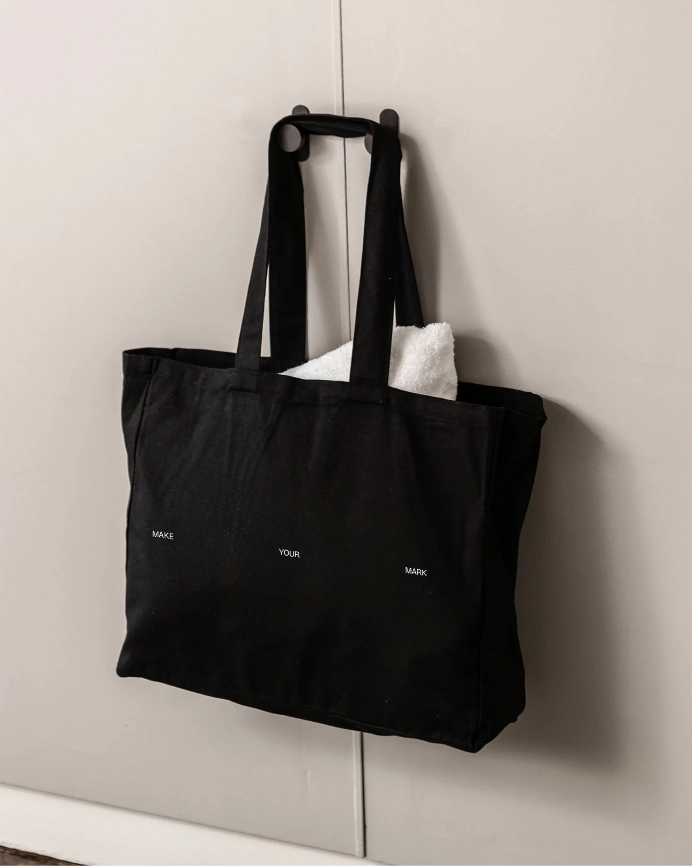
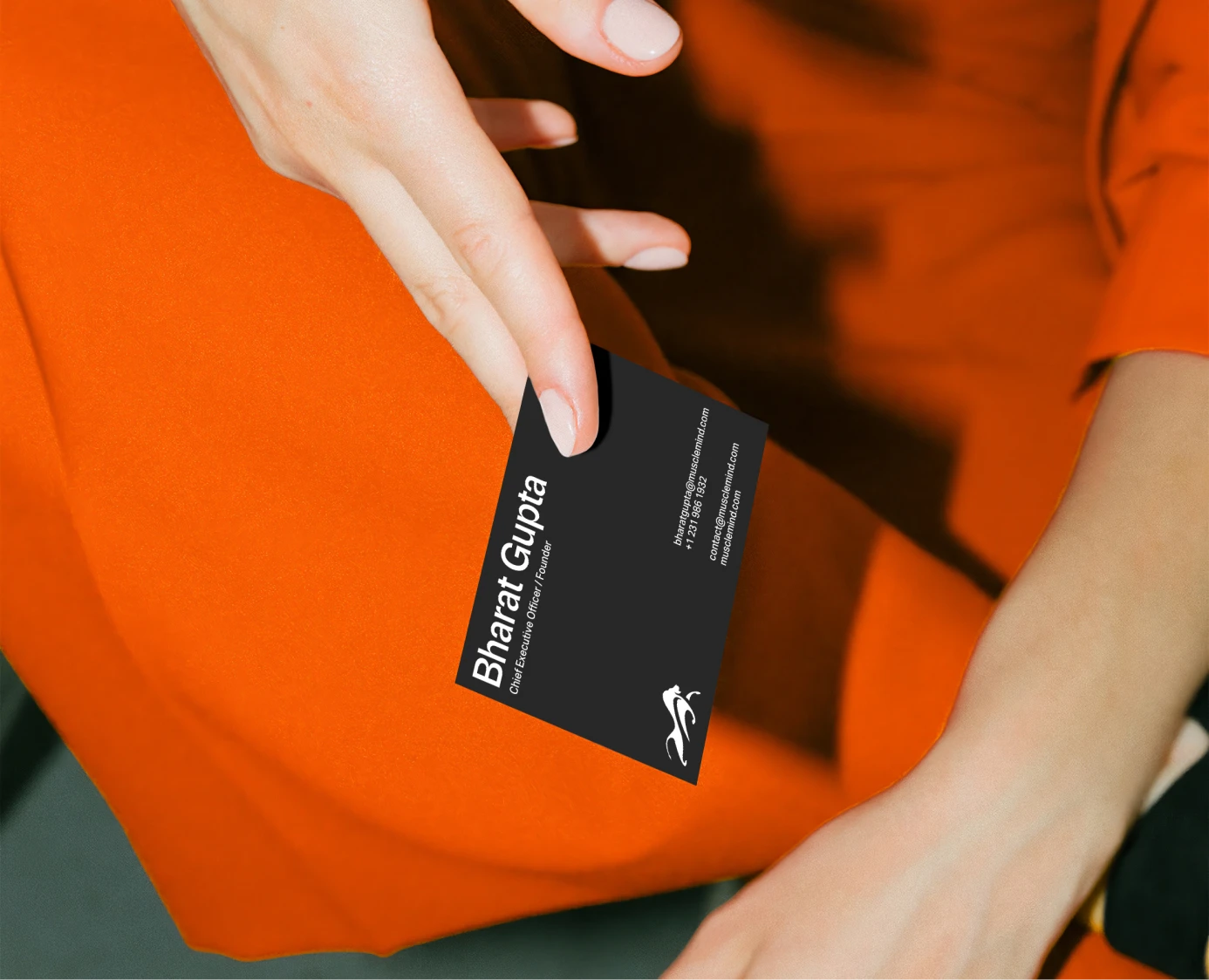
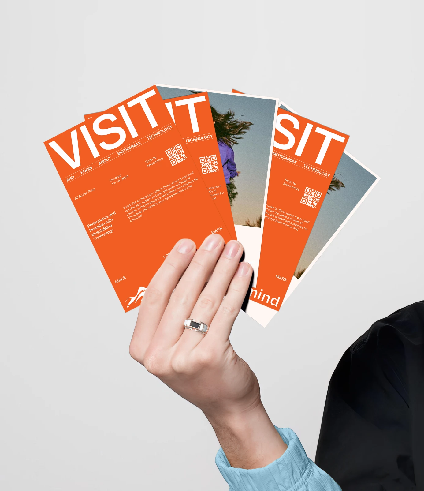
A brand identity only proves itself once it leaves the screen. We carried the system through business cards, brochures and letterheads, every touchpoint built to feel like the same brand rather than a logo pasted onto different paper.


Impact
Musclemind came away with a full identity built around one instinct: keep what already worked, and sharpen the rest. Colors split from the brand's own name. Icons that echo the wordmark's curve. Type built to carry both energy and calm in the same system. All of it holds its shape wherever it turns up, a card, a storefront, a shelf, without ever needing to announce itself. It fits the way the clothes already did.

Gonga Naveen Kumar
Brand & Strategy
Atreyi Balasubramaniam
Visual Communication Designer
Naveen Saini
Visual Communication Designer
Vivek Bhuvad
Visual Communication Designer
Swapnil Soni
Client Communications
Pavan Sachaniya
Motion Design
Bharat Gupta
Founder & CEO