CYN:LR
Getting a robotic arm to pick up an object it has never seen before, in any orientation, without pretraining, is a problem the industry has called robotics' holy grail. CynLr, short for Cybernetics Laboratory, was founded in 2019 by Gokul NA and Nikhil Ramaswamy to solve exactly that. They came to us in 2023, with engineering already ambitious enough to need a brand that could carry the same weight, something that represented their precision and vision rather than another generic robotics logo.
Before a single mark was drawn, we spent time with what CynLr actually believed in. Their engineering culture ran on one word, clarity, the discipline of questioning assumptions and building only what actually serves a purpose. That discipline traces back to Gokul, who spent years solving vision problems other engineers had given up on, long before CynLr existed as a company. We built the identity outward from that same instinct rather than starting with visual trends in robotics branding, so every choice that followed, the logo, the voice, the colors, had to earn its place the same way.
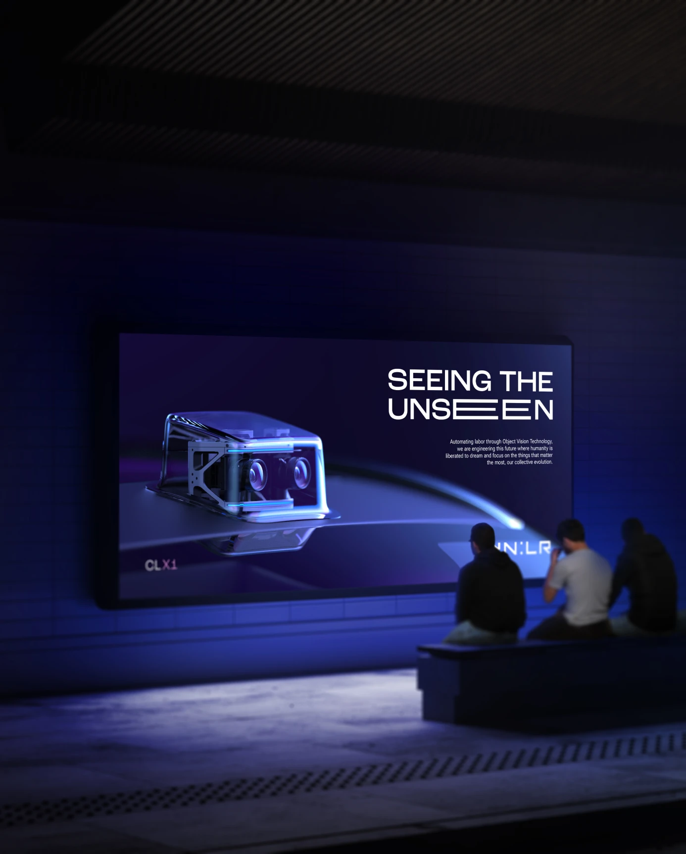
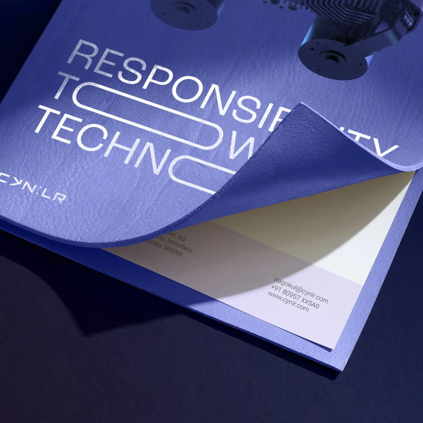
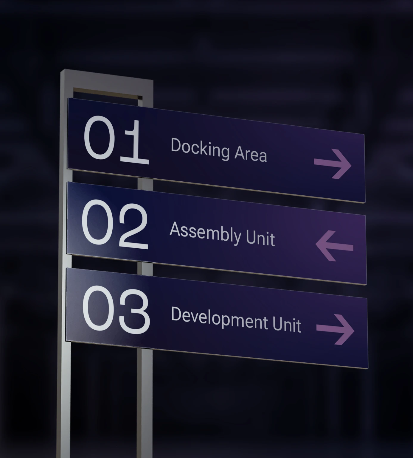
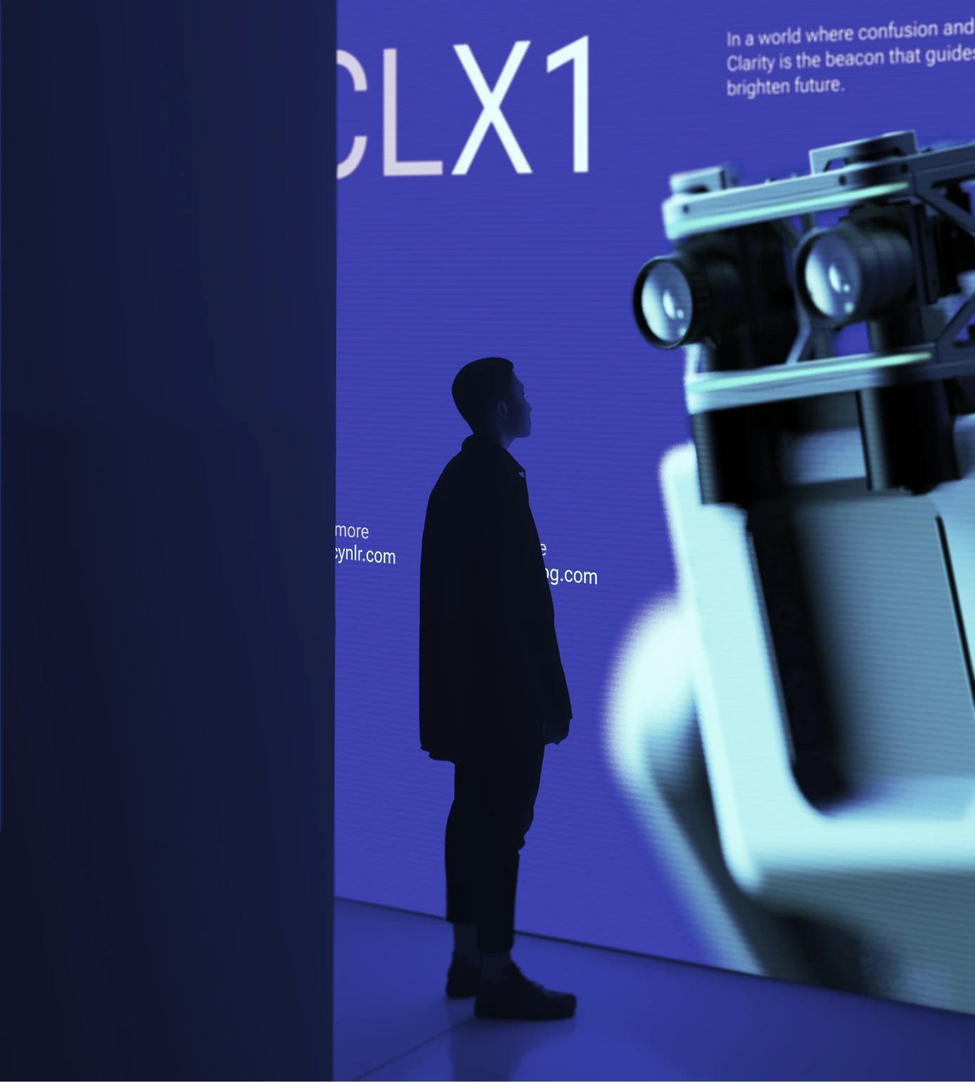
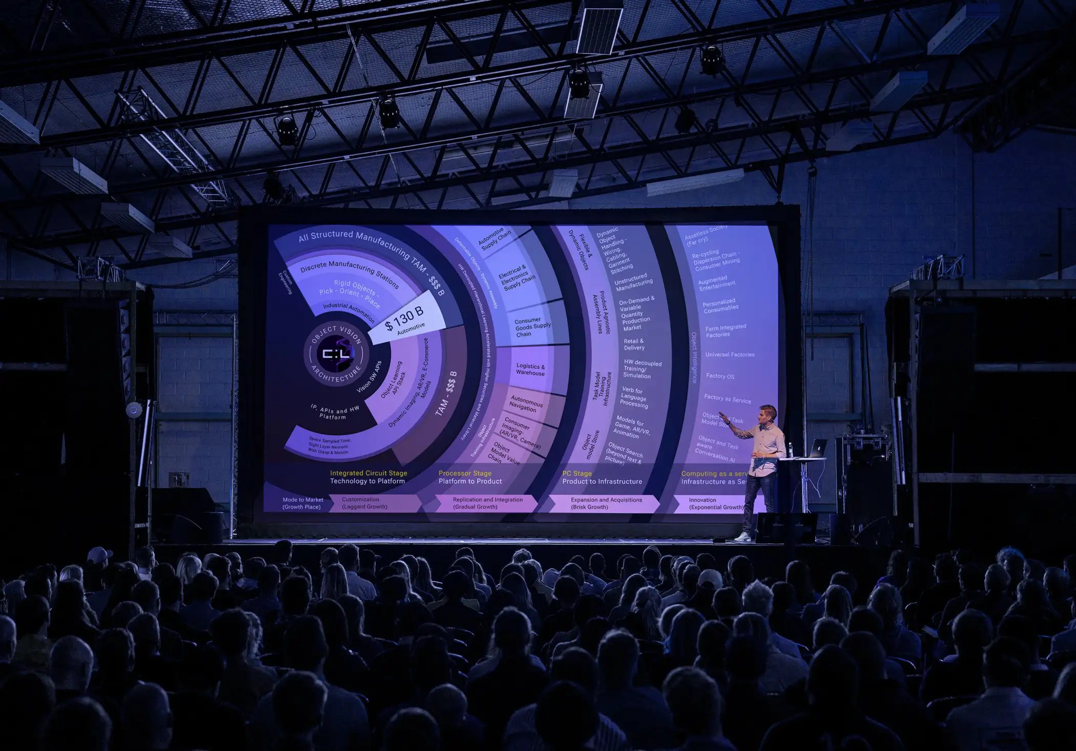
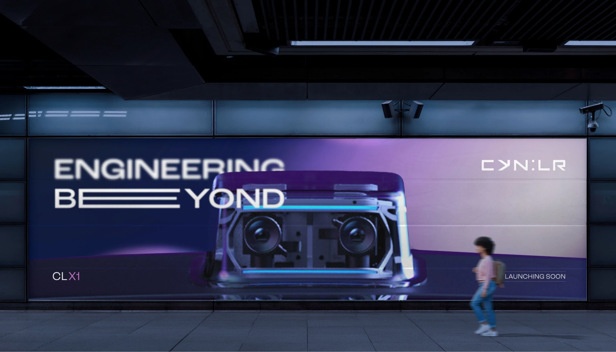
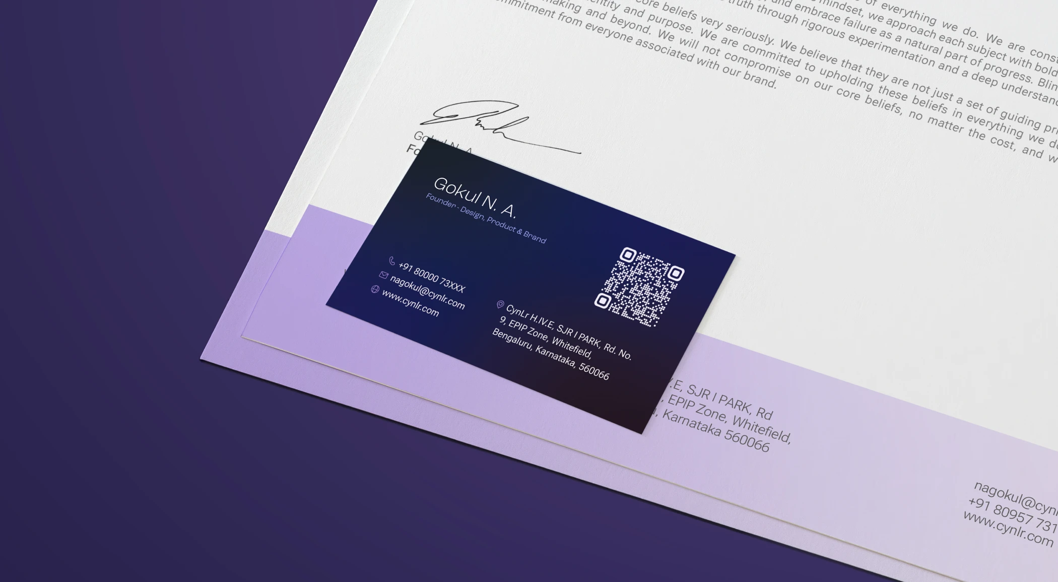
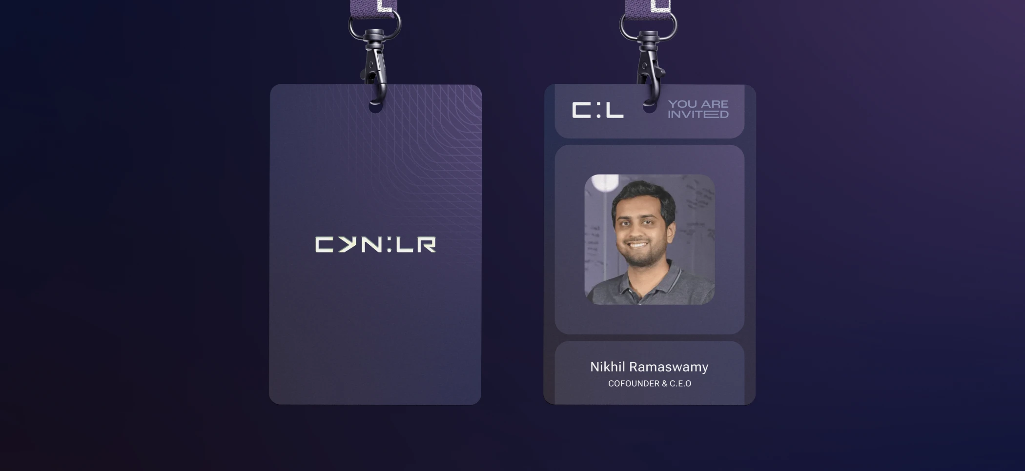
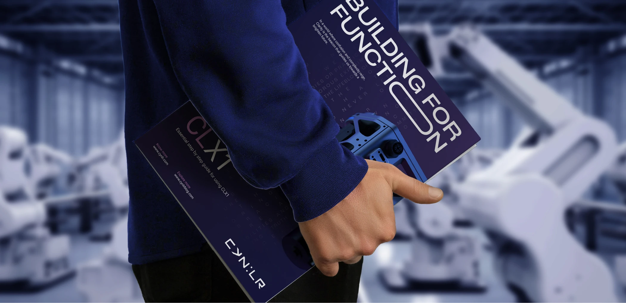
From there the work grew into a full identity system, covering everything from the logo and color palette to how CynLr sounds in writing and how its brand shows up on a business card or a presentation slide. The brand was built to grow alongside a company still proving what its technology could do, which meant nothing in it could afford to feel decorative or arbitrary.
Two Kinds of Sight
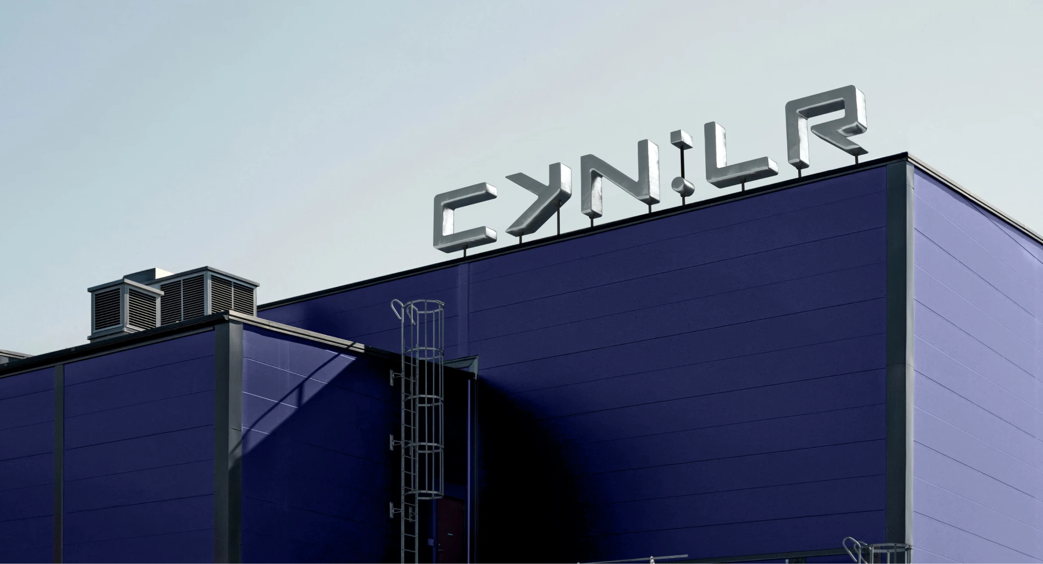
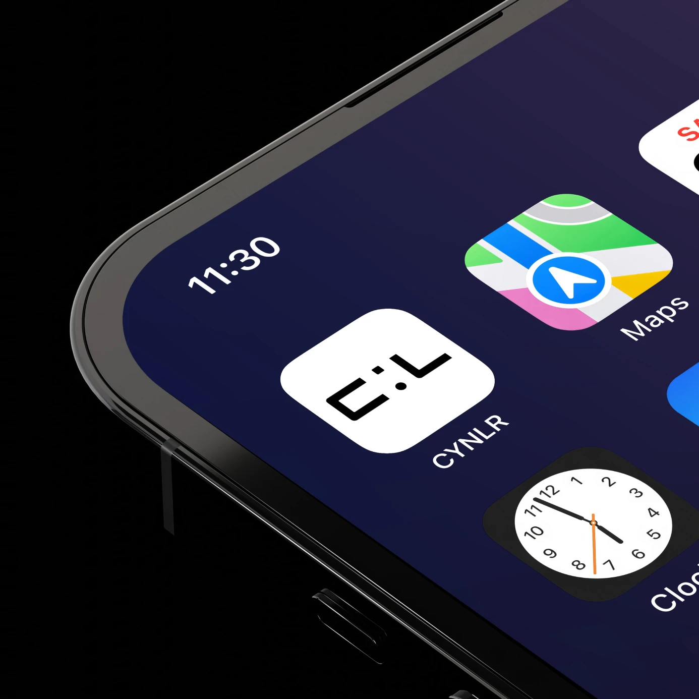
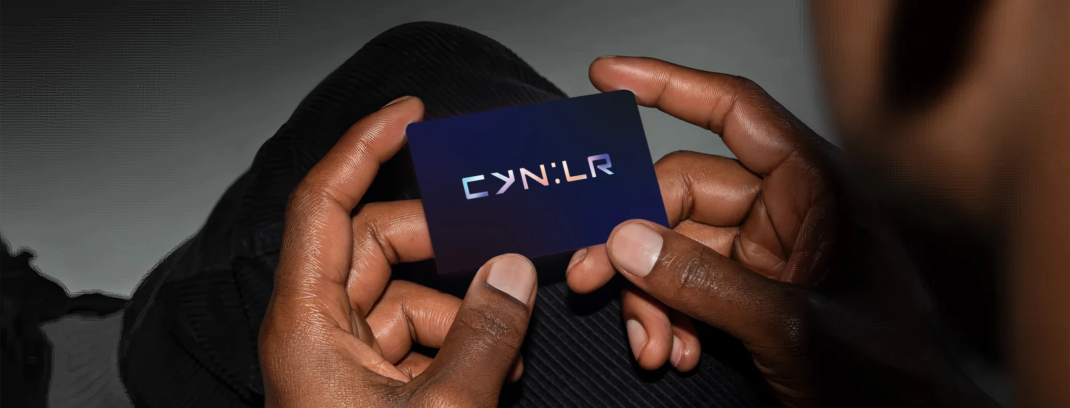
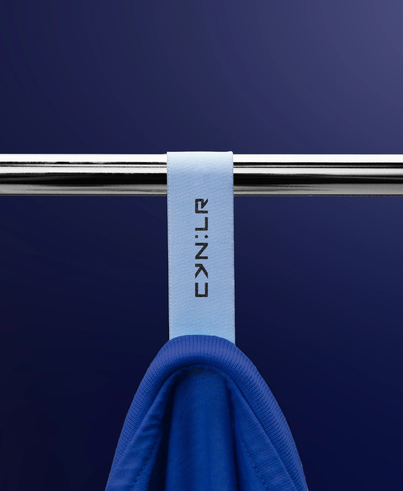
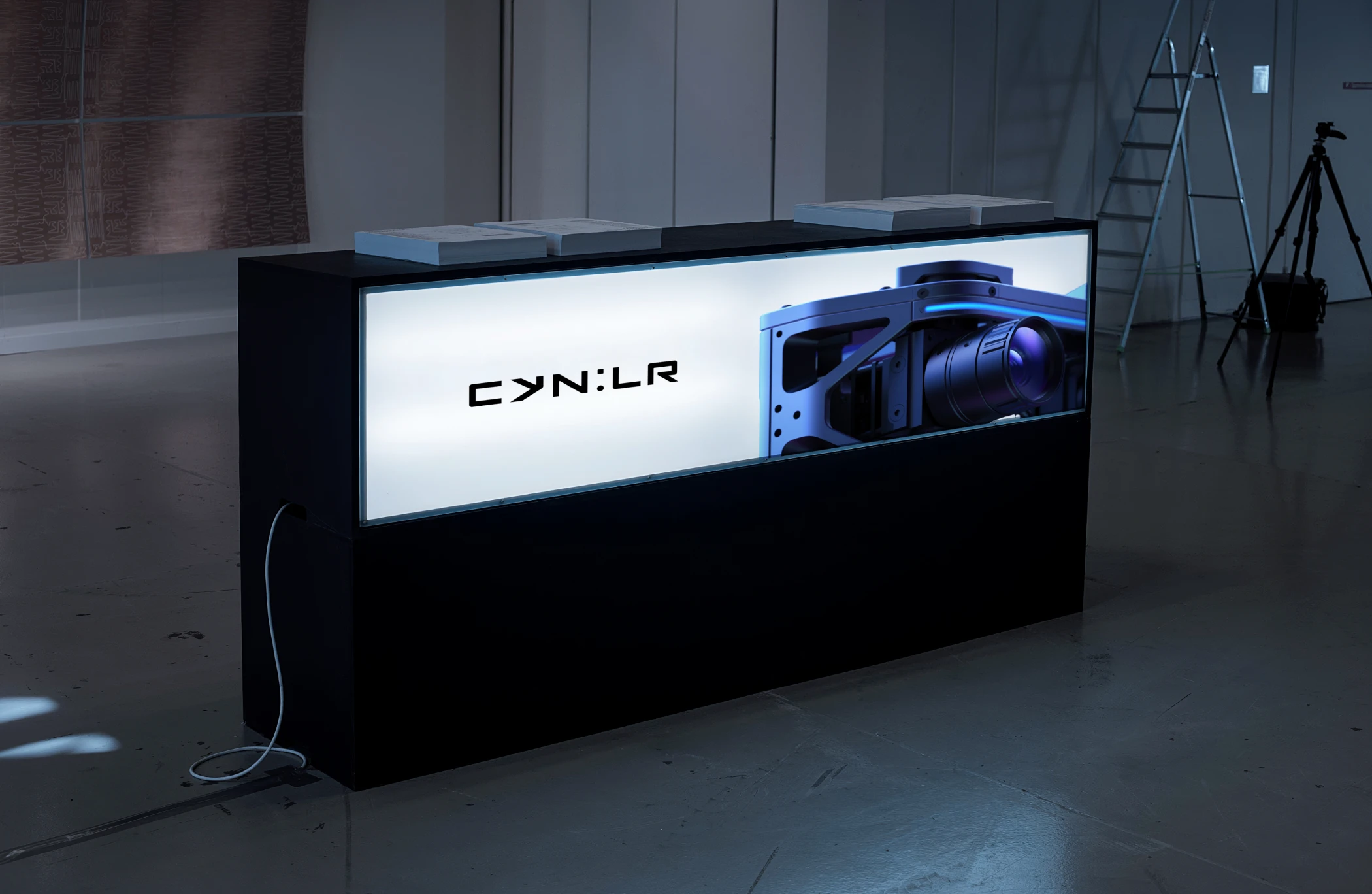
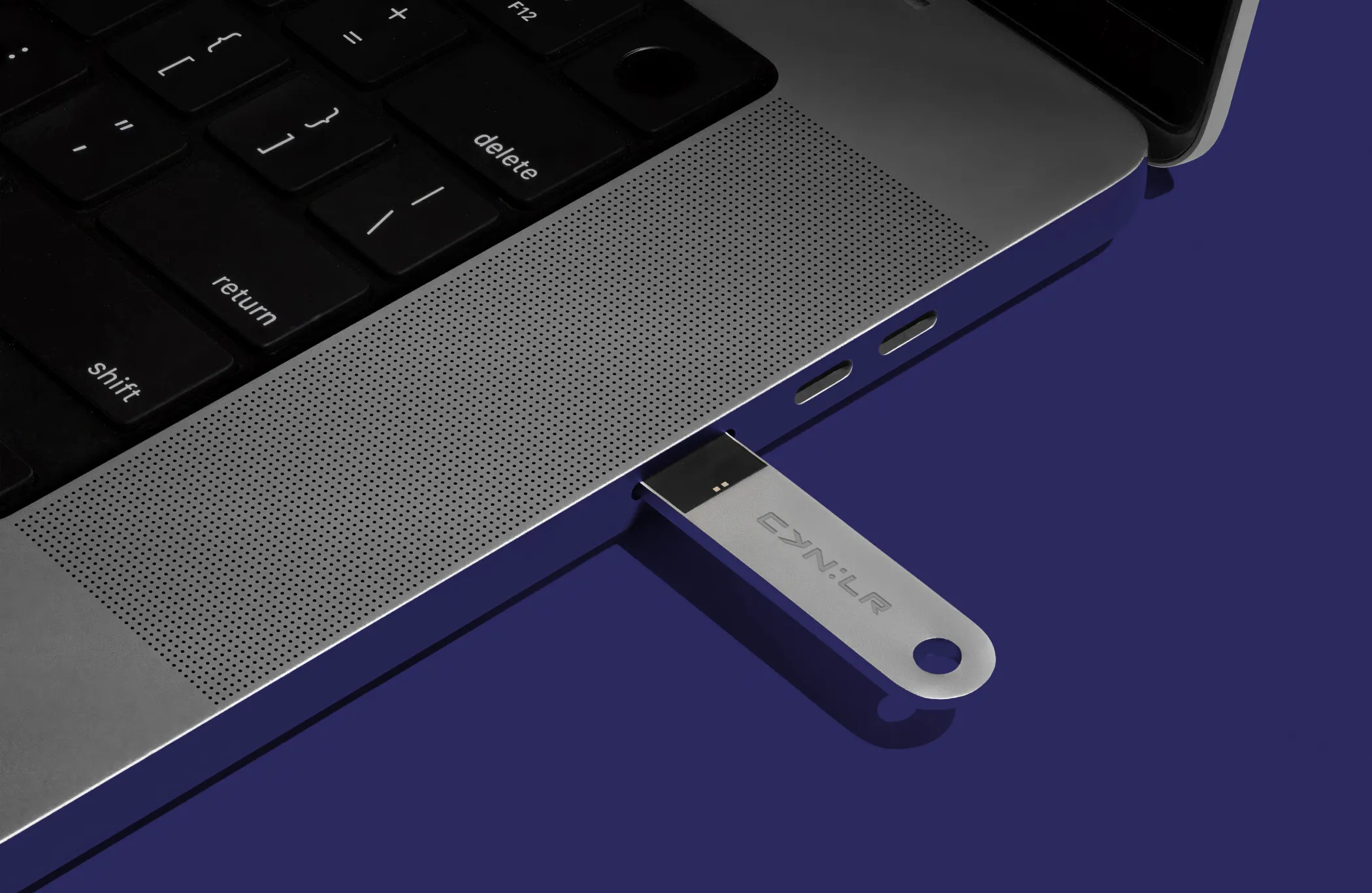
At the center of the identity sits a custom wordmark we call Cybergaze, with a shorter version, Cyberglimpse, for smaller spaces. The idea lives in the colon at the center of the name, one dot is a rounded square, one is a circle, human sight and robotic sight meeting in a single mark. The gap between the Y and C forms a forward pointing arrow, a quiet nod to where the company is headed.
Starts With No
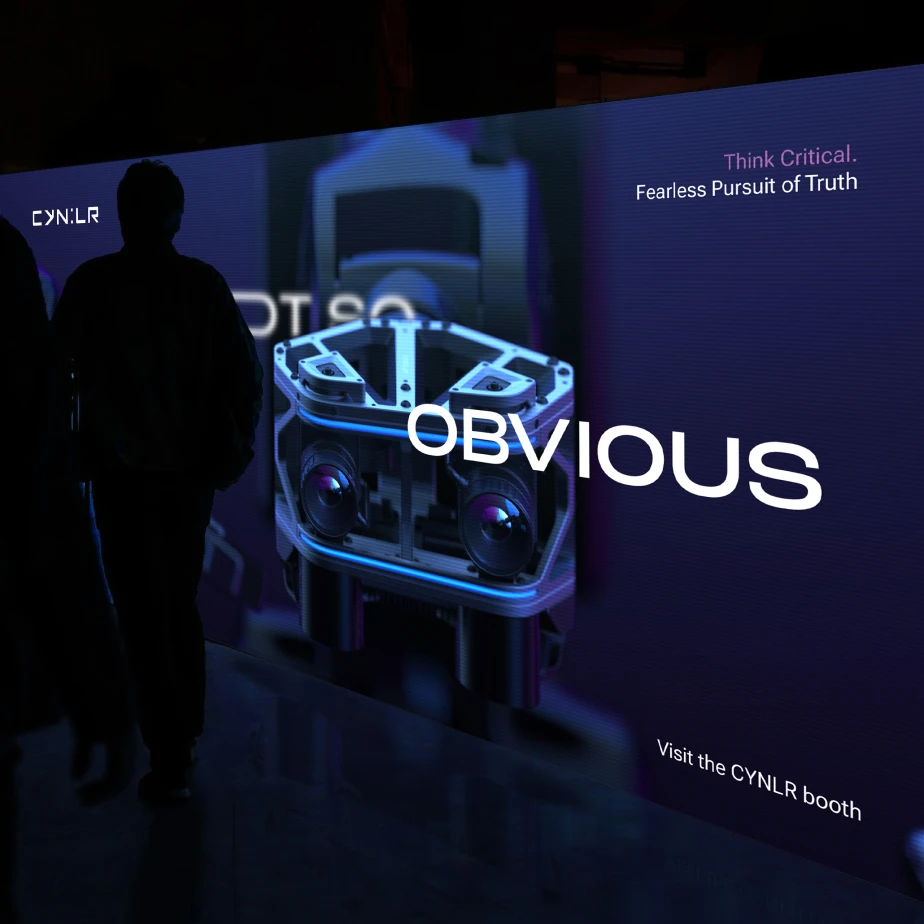
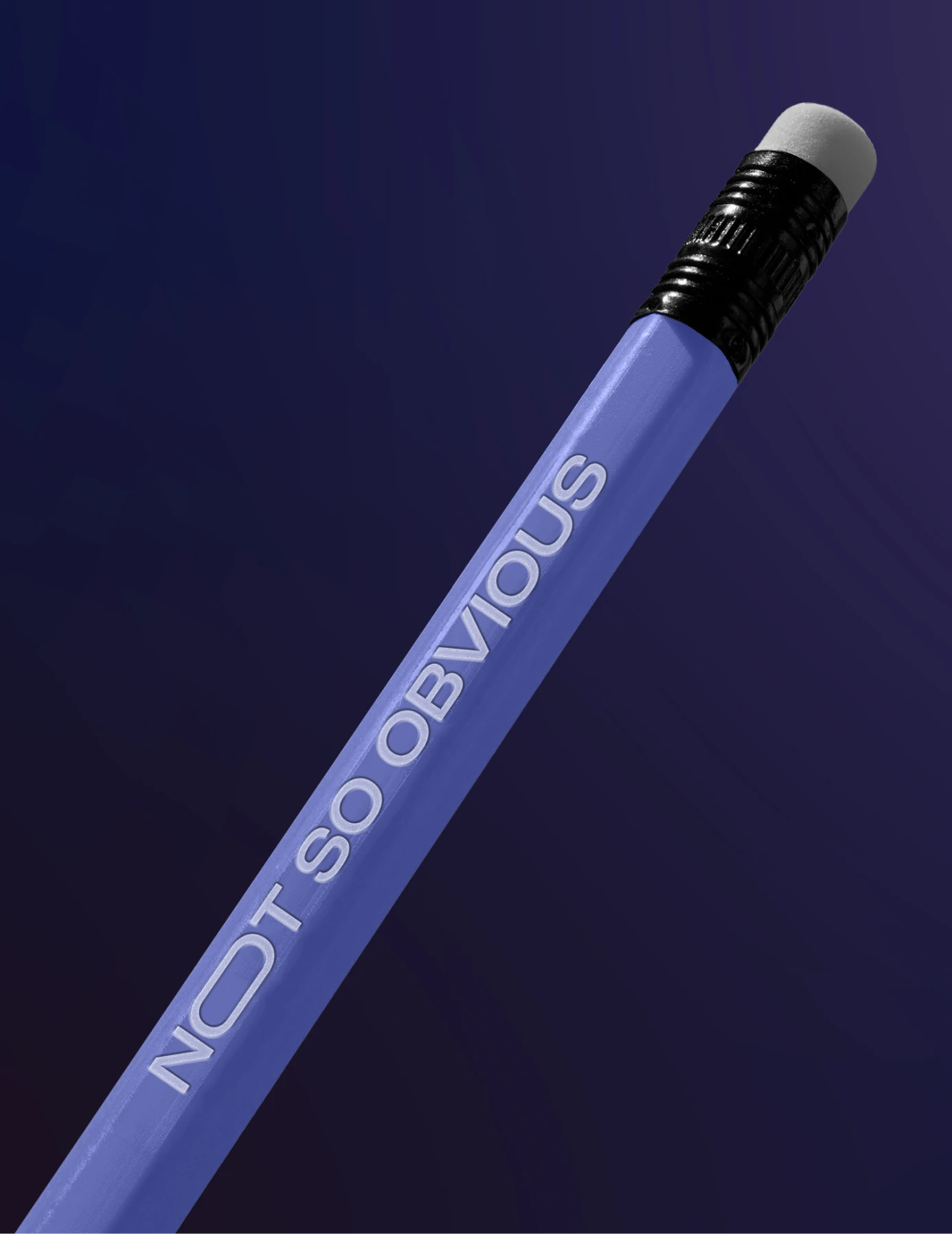
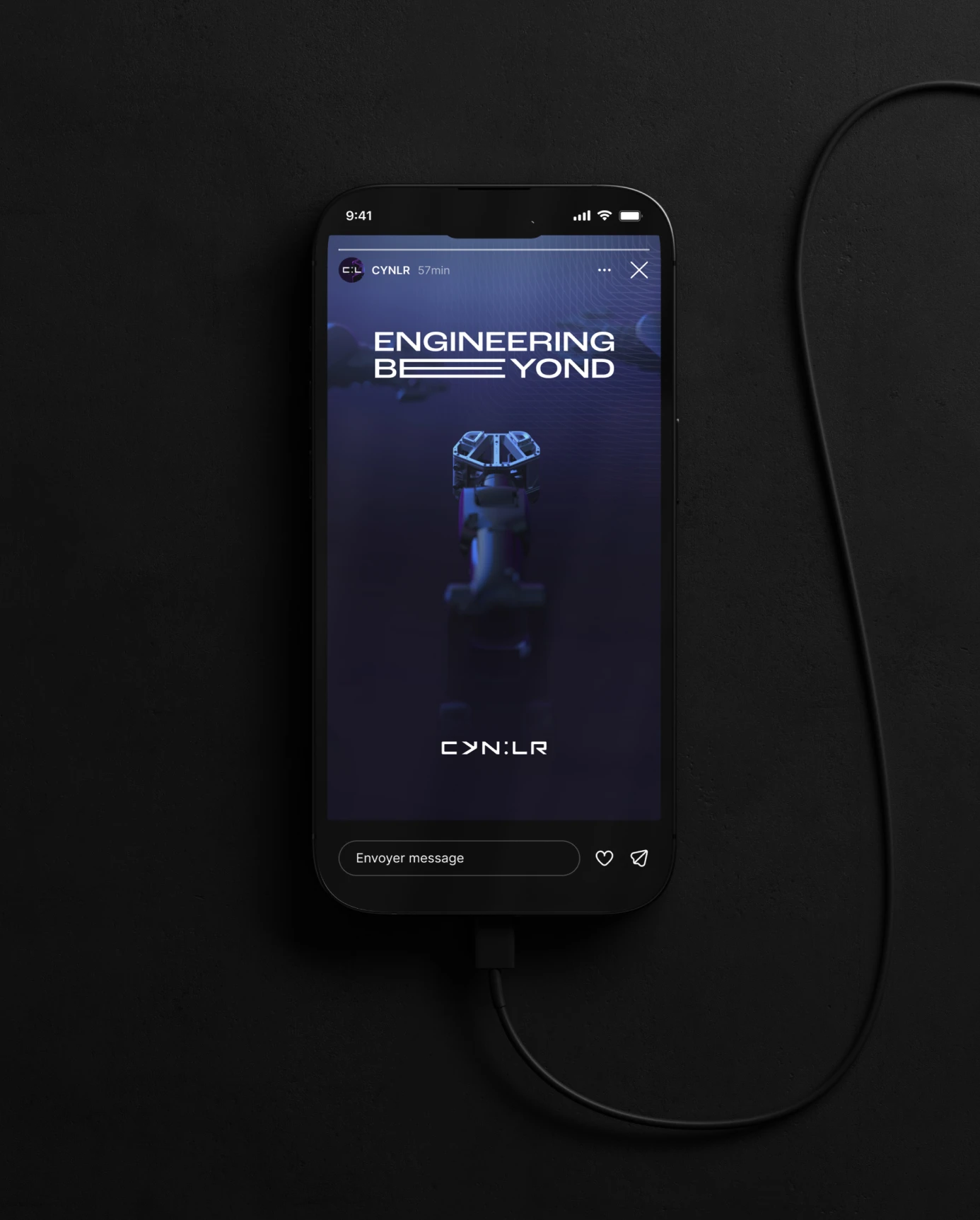
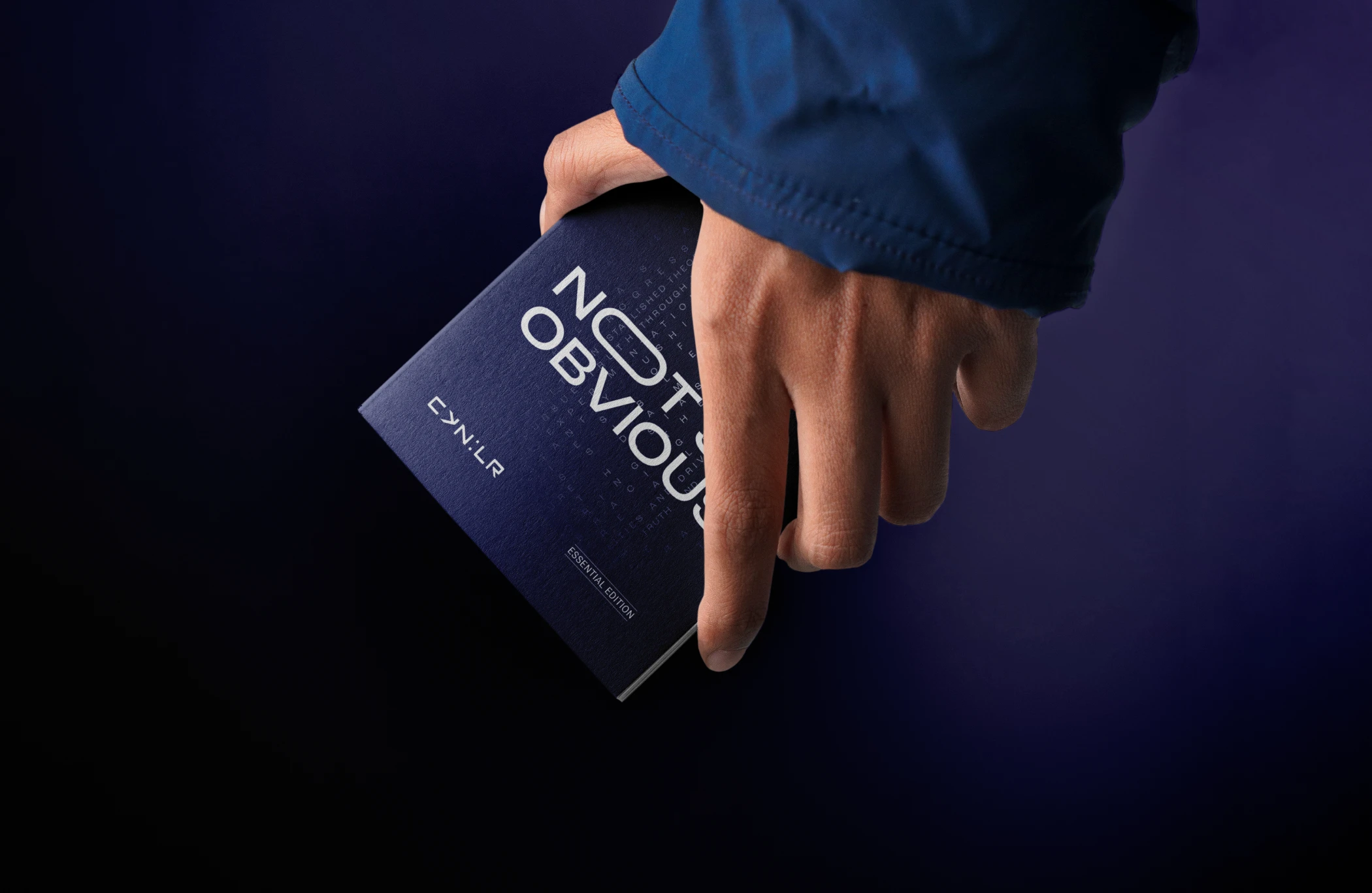
CynLr's main line is Not So Obvious, opening on purpose with the word Not, meant to catch people off guard before making its case. The voice built around it favors plain, direct sentences over hype.
Violet’s Wavelength
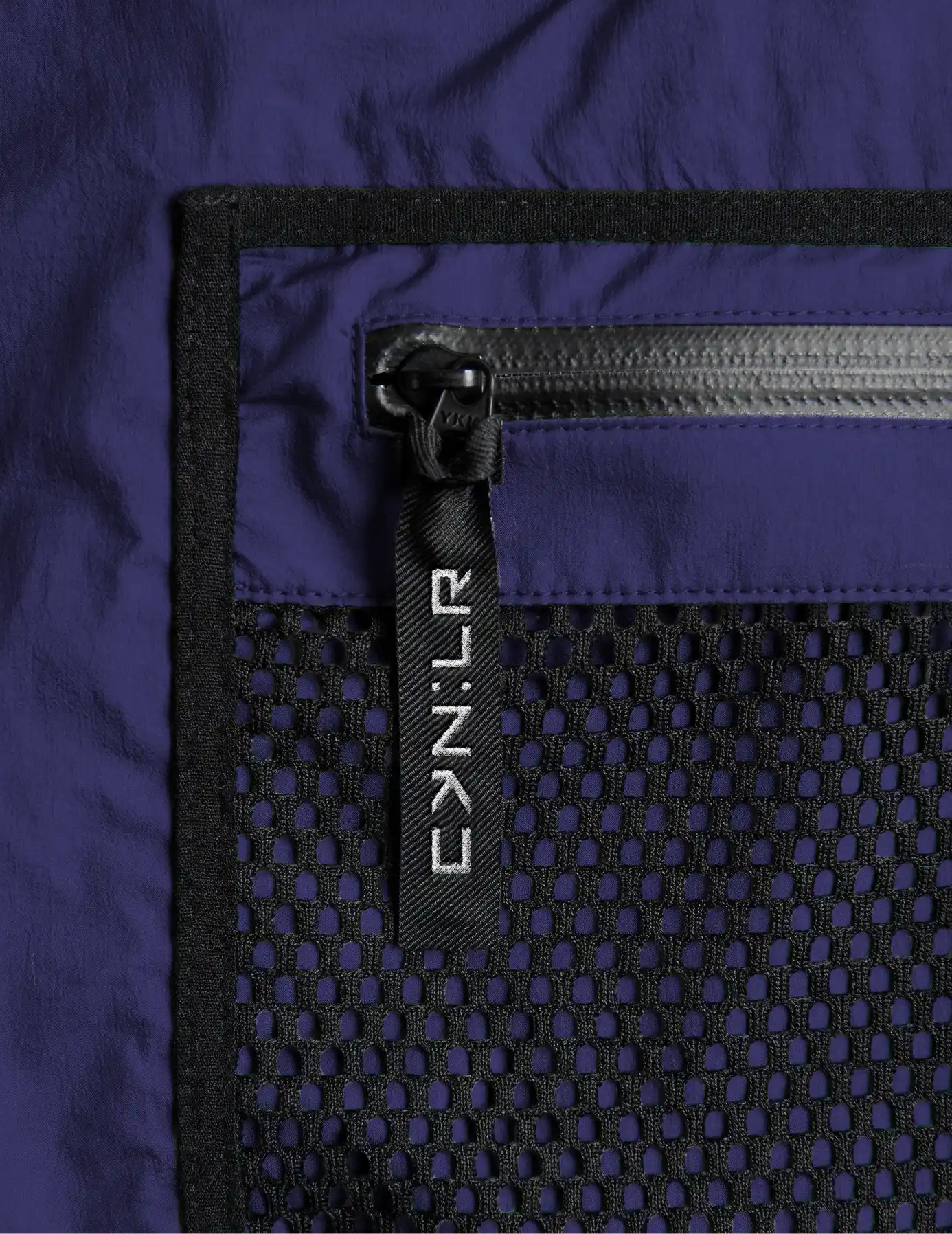
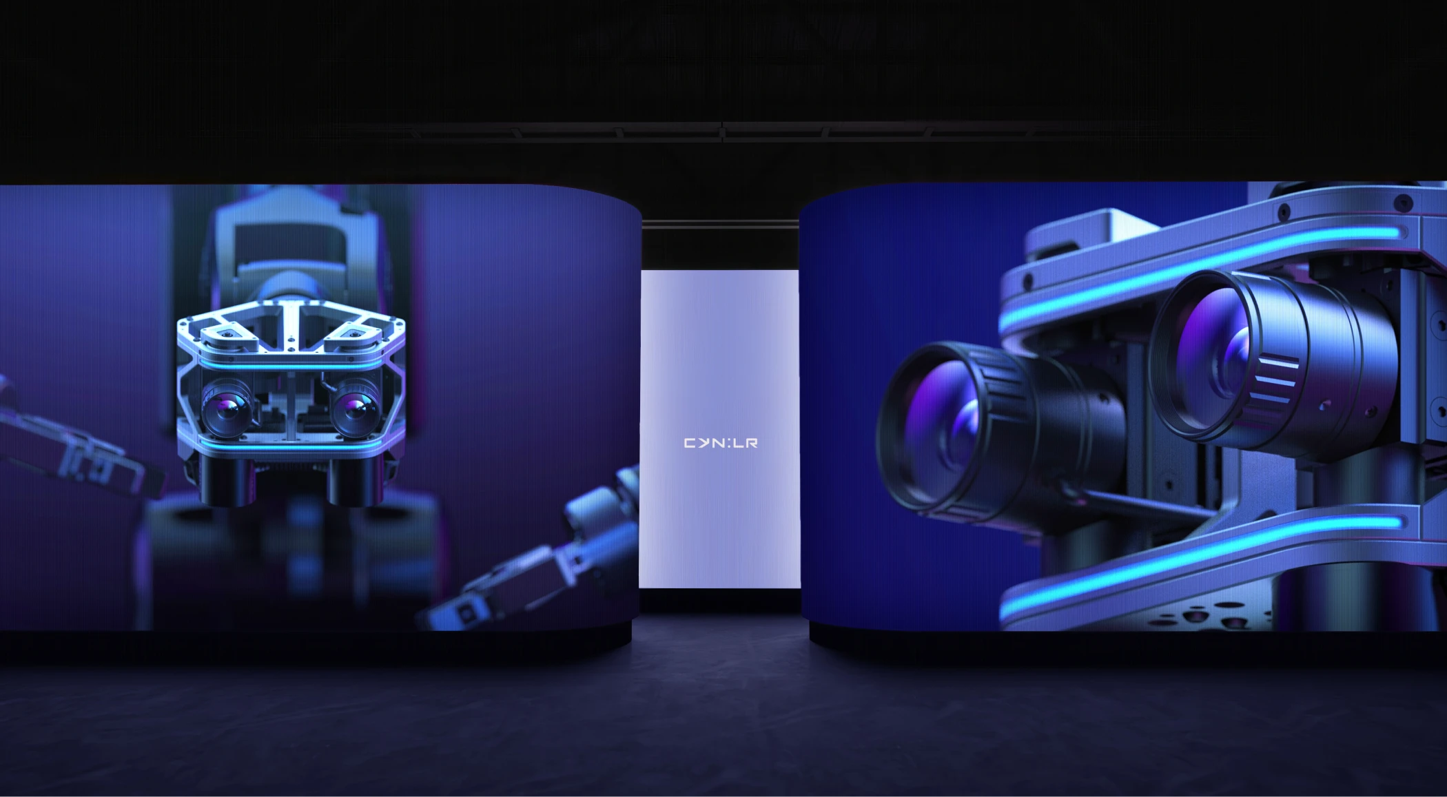
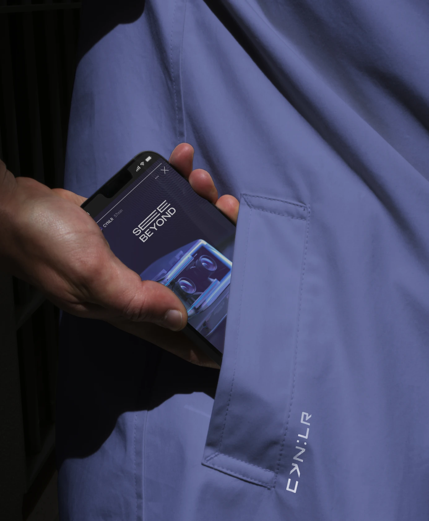
The palette centers on three trademark hues, Cyn:Blue, Cyn:Violet, and Cyn:Magenta. Violet sits behind the logic of all three, its wavelength lands at 400 nanometers, the most powerful point in visible light, and CynLr's colors are built to carry that same intensity. Around that core sits a wider range of lighter and darker versions, giving CynLr a palette flexible enough to run from a business card to a product screen without losing its identity.
Grown From One Symbol
Rather than inventing decoration separately from the mark, we built CynLr's supporting graphic elements directly out of the colon symbol at the heart of the signature. Cynetic Vision abstracts the square and circle into background shapes. Cynetic Moire reworks a classic optical pattern using one circular and one square grid instead of two circular ones. Cynetic Flow scatters type at an angle to suggest data in motion.
Impact
Since the 2023 rebrand, CynLr has scaled fast: Studio Carbon's product design for CynLr won the Golden Pin Design Award in 2023, and in November 2024 CynLr closed a $10 million Series A round co-led by Pavestone and Athera Venture Partners, bringing its total funding to $15.2 million. The raise fueled growth from a 60-person core team to a 120-person global workforce, with a new Design & Research Centre opened in Switzerland the same month. Our partnership with CynLr helped them create a level of investor confidence that pushed the deep-tech startup onto the global stage.
Gonga Naveen Kumar
Brand & Strategy
Shageera Mazid
Visual Communication Designer
Swapnil Soni
Spatial & Experience Designer
Gokul N A
Founder - Design, Product & Brand