Arceon
How do you rebrand a company that creates material composites already pushing their limits? Founded in 2018, Arceon builds carbon fiber reinforced composites built to hold their shape under extreme heat, materials for space, defense, semiconductor and energy work, where every component has to perform. They came to us in 2023 for an identity that could carry that weight, a visual language built from the same resilience the materials themselves are made of.
Before any visual work began, we spent time defining what Arceon actually stood for. We built an archetype, an internal image of the brand as a person, so every decision Arceon made afterward, in marketing, in collateral, in how they treated a customer or an employee, would trace back to the same source.
What emerged were four core values: transparency, precision, creativity, and collaboration, running through everything from how a material gets engineered to how a partnership gets managed. Underneath all four sat a specific kind of humility: Arceon's products don't change the world directly, they exist to enable other companies and innovators to push further than they could on their own. That positioning became the seed for Arceon's mission to transcend boundaries, threaded through the ethos, the strategy, and the visual identity alike.
The scope grew outward from there, a full visual identity across logo, colour, and typography, a nomenclature system for a growing family of materials, and a suite of collateral built to carry the identity into every client interaction.

A Blue Built for the Blind Spot
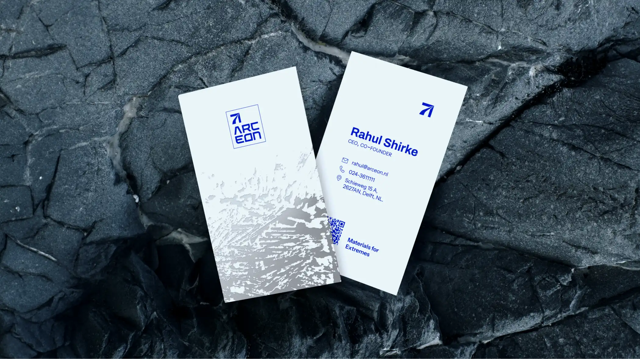
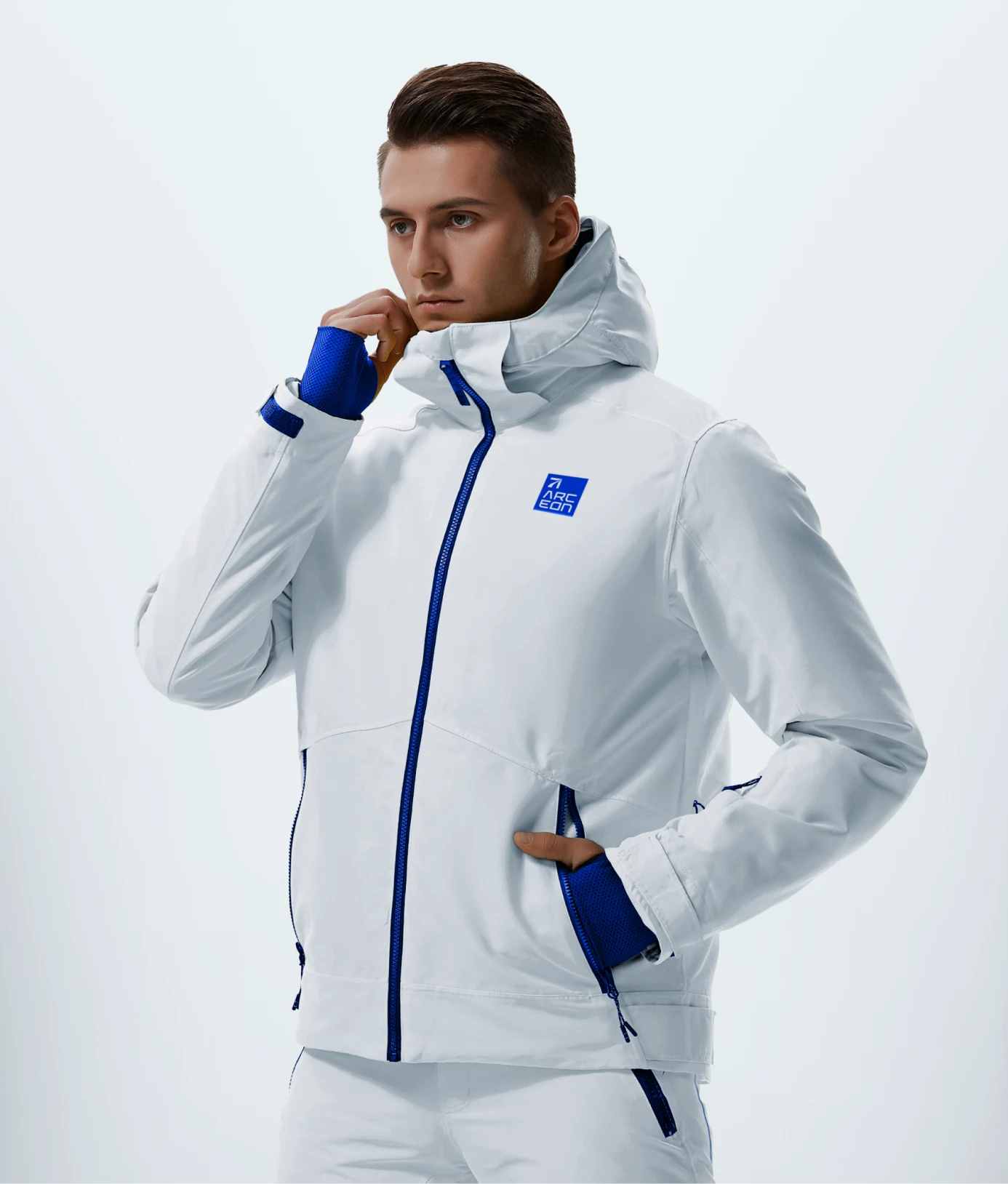
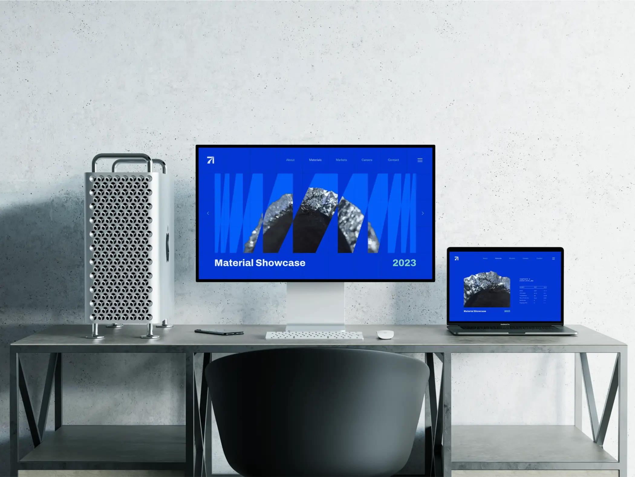
Arceon's palette centers on Arc Blue, an electric blue chosen to carry trust, security, and unshakable clarity, paired against Arc Grey, a neutral, clean tone that acts as a canvas rather than competing for attention. We started by mapping the sector's existing colors and marks, looking for a position that stood apart without straying so far that Arceon stopped reading as part of its own industry.



Off the Screen, Into Our Hands
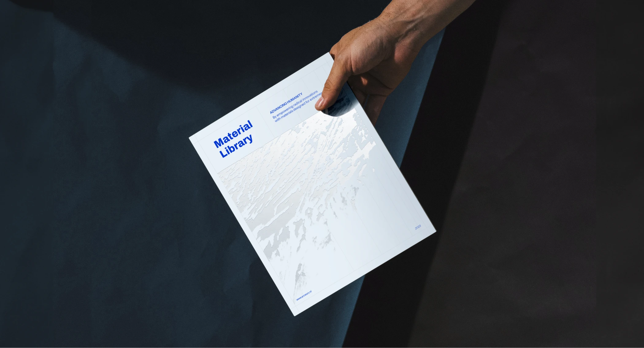
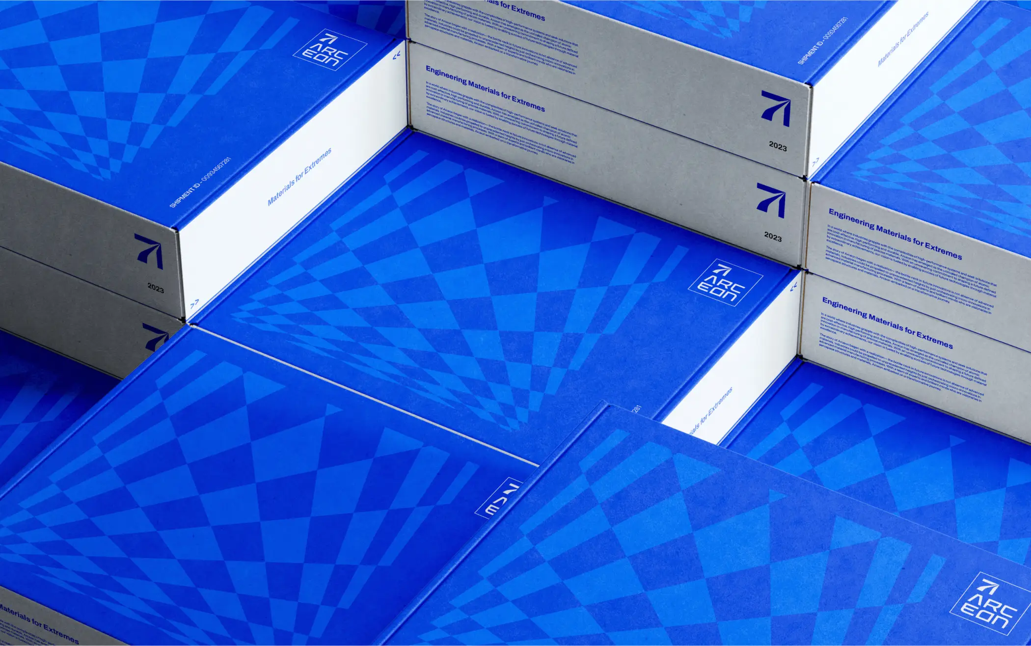
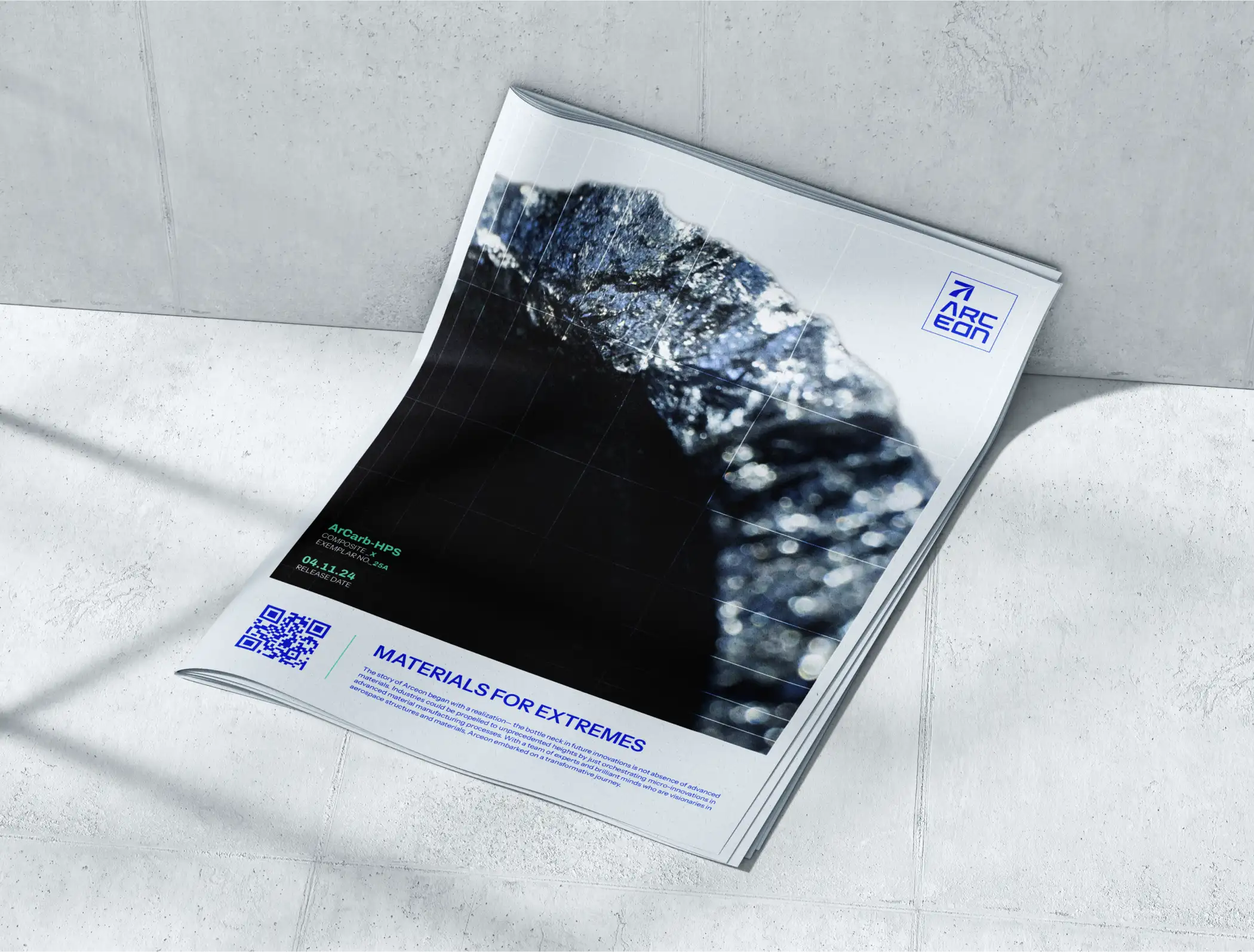
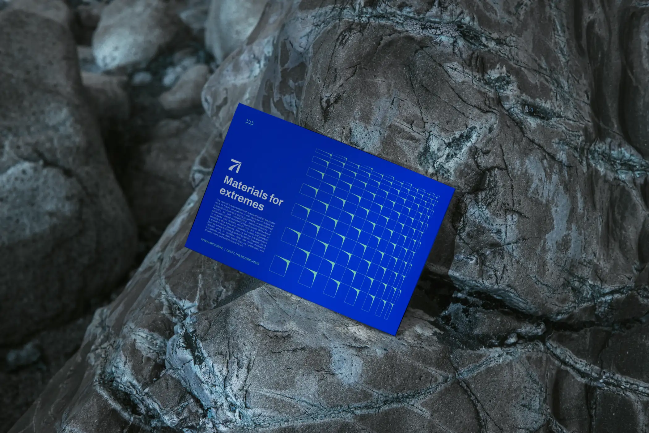
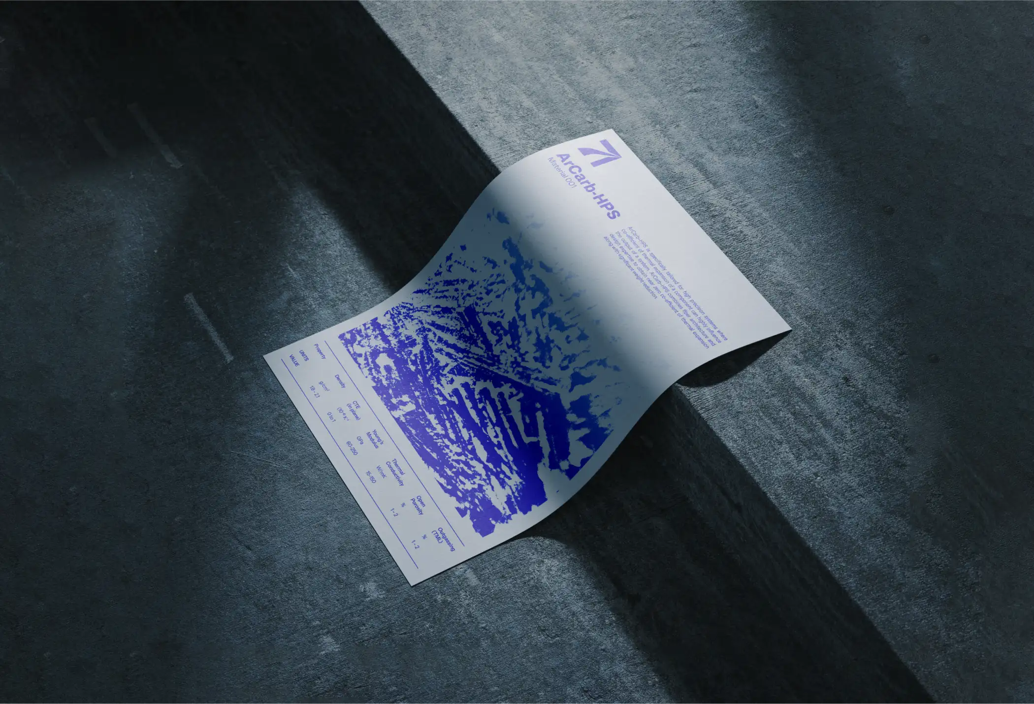
Most brand identities start on a screen. We started with our hands, working with paper cutouts and a variety of textures. That physical contact opened up an idea close to synesthesia, connecting touch to sight without ever asking a viewer to physically touch the brand. The visual language that resulted runs on four layers, patterns, textures, photography, and an invisible modular grid underneath it all.
A Name Built to Scale
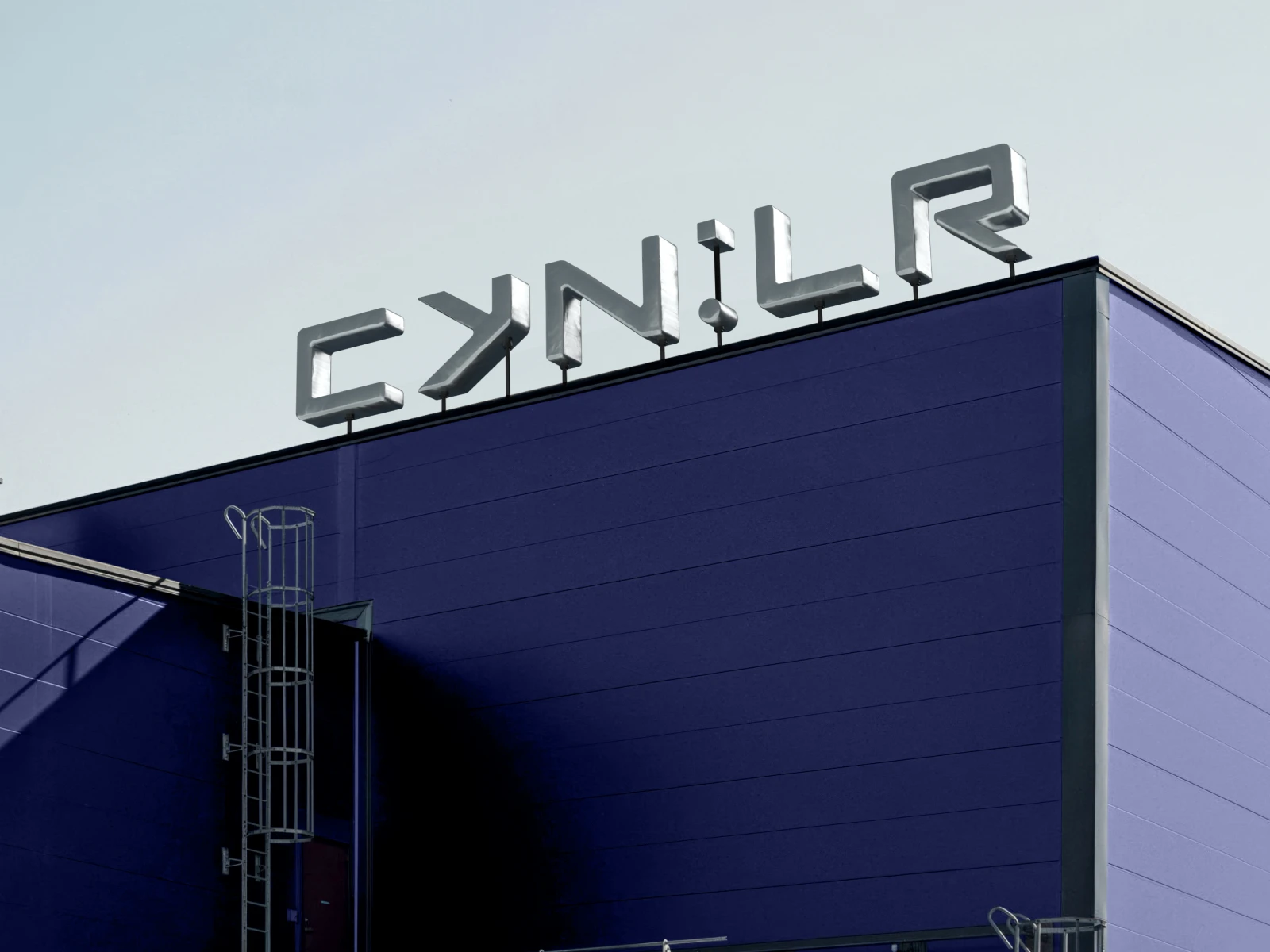
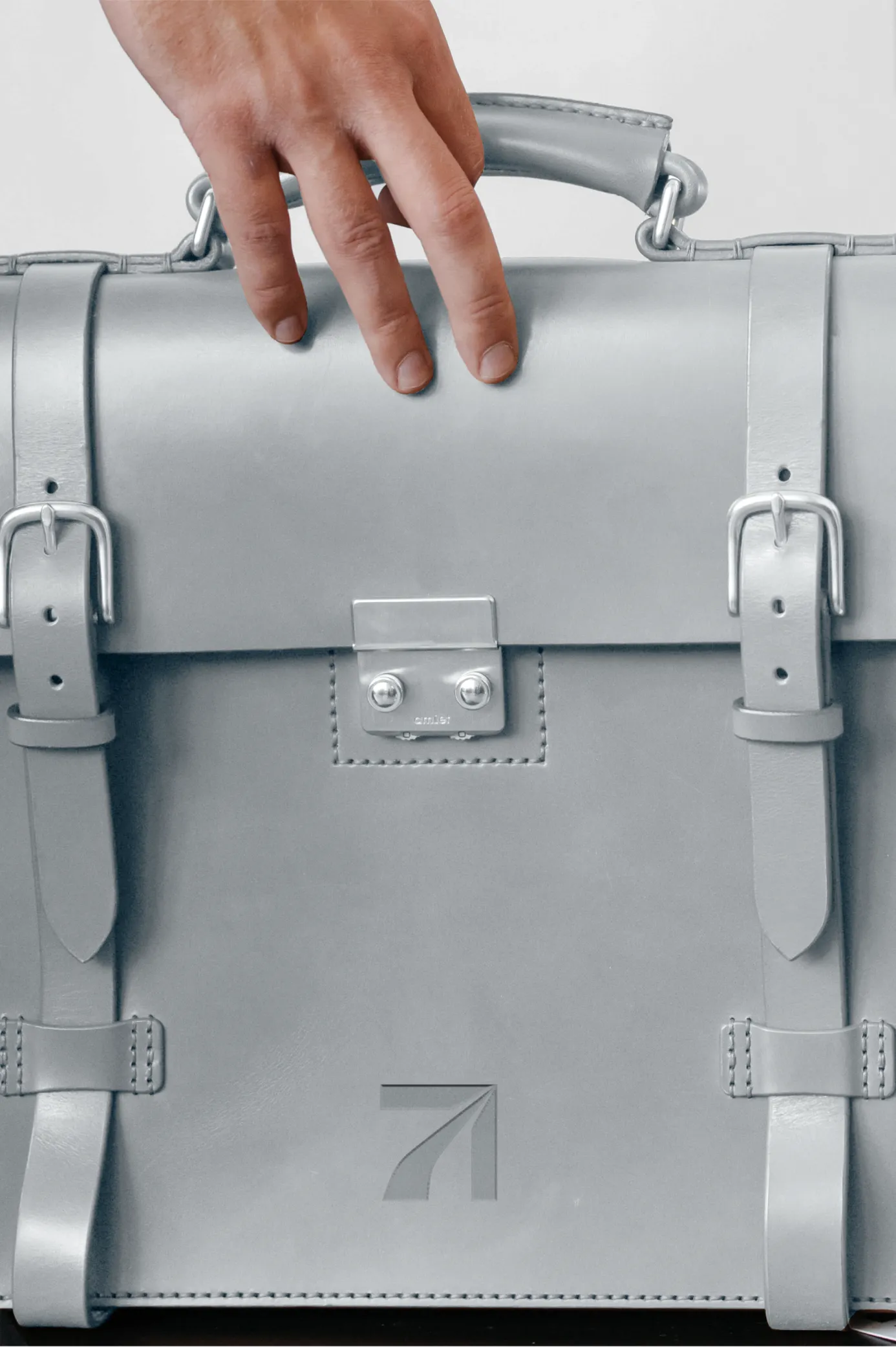
Arceon's name carries its meaning inside it, arc, a curvature or trajectory, fused with eon, a long span of time, together describing a path across years rather than a single moment. The logo makes that same idea visible, in a single combination mark, the wordmark and icon working as one shape rather than two elements side by side. That same eon suffix anchors the nomenclature system too, each material name pairing an abbreviation of its core substance with eon and a letter marking its standout property.





Impact
Arceon ended up with an identity that speaks the same language as its product, resilient, precise, and built to hold up under pressure. Every mark in the system traces back to something physical, the material itself, the trajectory in the name, the discipline in the values. The clearest sign it worked came after the project ended: prospective clients who saw Arceon's pitch decks came to Studio Carbon afterward for their own branding, having seen firsthand how the thinking held together.

Itika Gupta
Brand Designer
Siddhi Kansara
Brand Strategist
Shageera Mazid
Visual Communication Designer
Rahul Shirke
Co-founder & CEO