Wutabon
Wutabon didn't exist yet when Philip Chong reached out, not really. For years, the idea had lived quietly inside QARI, the immigrant-services organization Chong led in Quincy, Massachusetts: a focused effort to connect immigrant workers with employers, onsite, at scale. By late 2024, that effort had earned its own name and its own company. It just didn't have a digital home yet.
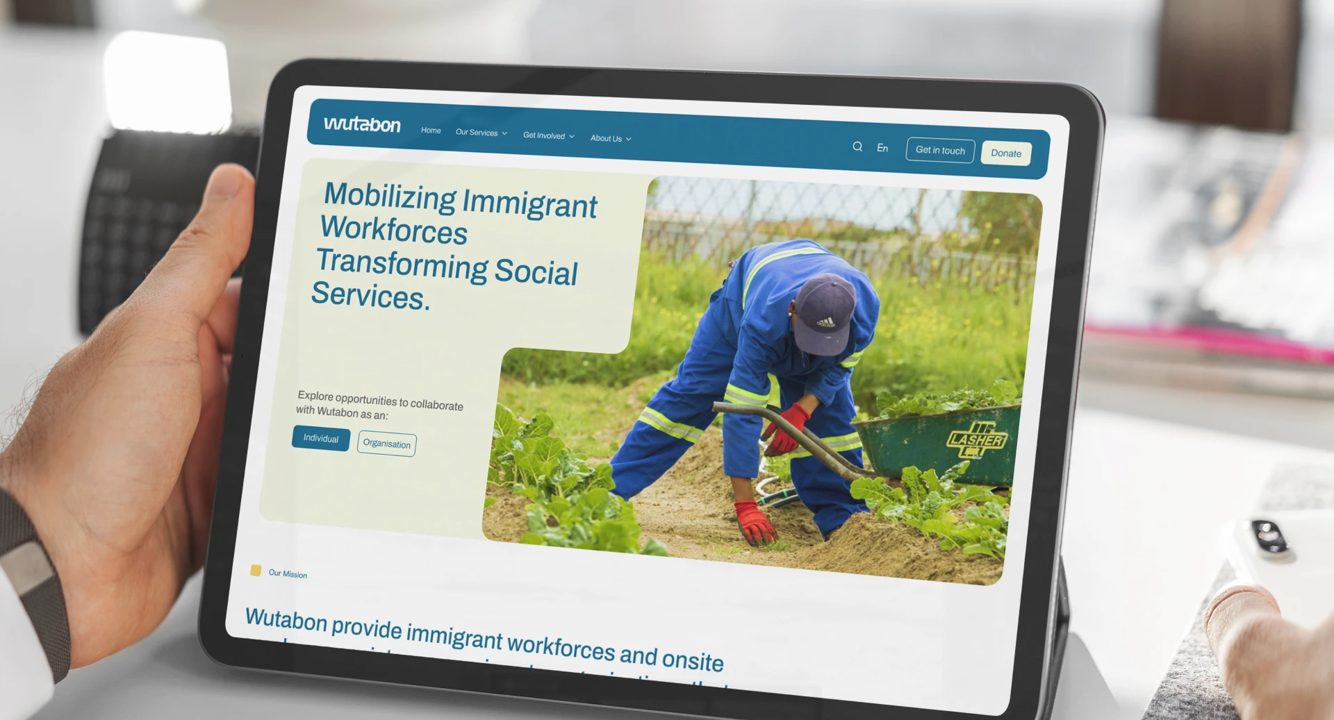
Wutabon's core idea was pathways, between people looking for meaningful work and companies looking for reliable talent. We built the brand and the website around that single idea, starting from a blank page.
The scope covered identity design and a full website: concept, visual design, copywriting, and development in Webflow. Wutabon already had a strong library of photography from earlier initiatives, so our job wasn't to generate imagery. It was to give an idea its shape.
The logo carries the concept most directly: letters that connect into one another, echoing the act of linking an employer to an employee. That idea of two things meeting had to run through the whole site, so we built a shape language around it. Forms that fuse and interlock across the pages, giving Wutabon a visual signature distinct from the two organizations it grew out of, QARI and People Ventures. The brand needed to read as family, without disappearing into one.
Structuring the site meant solving for two audiences at once: individuals looking for work, and companies looking to hire. We built the navigation and the content architecture around that split, a decision that ended up shaping the brand as much as the logo did.
Colour of Confidence
Wutabon sits in an unusual emotional register. It has to read as credible to companies making hiring decisions, and as hopeful to people rebuilding a life in a new country. A palette that leaned too corporate would have felt cold to the second group. One that leaned too warm would have undercut the first. We designed a palette of deep blue paired with an ivory cream. Formal, yet warm enough to read as forward-looking.

.webp)
.webp)
Defining Connection
Wutabon's entire reason for existing is to close the distance between an immigrant worker and an employer willing to hire them, so the mark needed to embody a link. We designed the identity so specific letters visibly join the ones beside them, turning the wordmark into a small demonstration of the company's purpose. This style was taken ahead throughout the website, creating connecting shapes for each section.
.webp)
.webp)
.webp)
.webp)
Dual Registers
Midway through the website work, a bigger question surfaced: who was this website for? Wutabon exists at the intersection of individuals seeking employment and companies seeking to hire, and speaking to both on the same pages was diluting the message for each. Working through this with the Wutabon team, we split the site's architecture in two dedicated pathways for individuals and for companies, each with its own information and its own register. This feature reshaped how Wutabon talks about its own work.
.webp)
.webp)
.webp)
Impact
The clearest sign the work mattered didn't come from a number. It came from watching Wutabon start to describe itself differently. Structuring the site around two audiences forced an internal clarity that outlasted the project, about who Wutabon serves and how to say so. Once the identity existed outside a slide deck, it gave a newly independent organization a face steady enough for employers and workers alike to recognize and trust. Wutabon has kept building since, most recently launching a hospitality training program with Quincy College, on an identity that was only ever meant to give the story a face.
.webp)
Jitesh
Project Lead, Creative Lead, Webflow Development
Vivek
Visual Design
Mallika
Website Designer, UI
Do-Yeon Kim
Visual Designer
Eva Chu
Visual Designer
Rasika Kale
Main Point of Contact, Content Structure
Emily Canner
Design & Content Review
Ligia Diaz
Design & Content Review