Diabesties
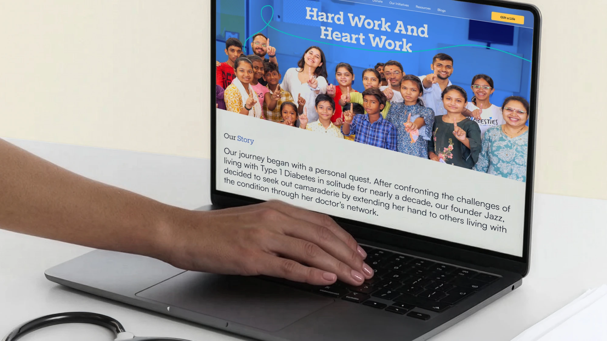
The Diabesties Foundation reaches more than 54,000 people living with diabetes. Free education sessions, insulin for children whose families cannot afford it, peer counselling, policy advocacy. Almost none of that was easy to find on their old website. Their work was buried in an archive nobody on their team could update, told in the heavy tone that non-profits default to. They came to us to change that.
The brief began with the narrative. Diabesties had a website that had gone un-updated for years. The material was all there, a great deal of it. But it was hard to navigate, and the way it was presented did not match the scale of the work behind it. The team could not make quick edits themselves, so content aged in place.
Underneath that sat a positioning problem. The old site read like a typical NGO site: one that elaborates the problem until the problem becomes the whole story. Type 1 diabetes is serious and relentless. That is true. But it is not the truth the founder, Jazz Sethi lives. She was diagnosed with Type 1 Diabetes at thirteen, and now she is the liveliest person in any room she walks into.
So we worked in two directions at once. We refreshed the visual language of the brand. Colour, typography, illustration, graphic elements and motion, to carry that energy honestly. And we restructured, designed and built the website around it in Webflow, working with their team on how the content should be grouped, sequenced and worded.
.webp)
.webp)
Impact First
The founder was the argument. Jazz has Type 1 diabetes and has not let it narrow her life, and the brand had been describing a condition instead of describing her. We inverted the order: lead with what Diabesties has built and changed, and let the difficulty sit as context rather than headline. Every decision for the website design was a way of making that inversion visible to the readers.
.webp)
Playfully Bold
This was the tightest constraint on the project. Push the playfulness too far and the brand stops taking the condition seriously, which fails the people it exists for. Pull back too far and you rebuild the dull, heavy tone they came to us to escape. We balanced the line with our illustration style. Hand-drawn, fluid, full of movement, but never joking. The seriousness lives in the work. The energy lives in how it is shown.
.webp)
Moving Lives
While the colour and type set the tone, motion is what made the pages feel alive. We used it deliberately and heavily. Section transitions that carry the reader forward, and animation in the places where a concept was hard to explain in a sentence, like what you actually have to manage day to day with Type 1 diabetes.
.webp)
Content Management.
Six years of programmes had accumulated without a system to hold them. We grouped everything under three pillars — Advocacy & Access, Education, Support. Then we created a robust content management system. We architected the CMS around how their team actually thinks: add a project, add an image, add a page. The success of this system wasn’t just launch-readiness, but how useful it would be to update everyday after that.
.webp)
Impact
Diabesties no longer disappears into a sea of organisations doing similar work. The team took the brand past the website, into their social media posts, into the decks they present at national and international forums, and it has proved its worth. So has the site. They have since added new work to it, including D-Coded and a page for Neev, their physical centre in Ahmedabad. The clearest sign that our design worked is that they did not need us to keep it going.
Kanishk Sharma
Project Lead
Swapnil Soni
Visual Designer
Itika Gupta
Project Coordinator
Jitesh Devadiga
Web Developer
Pavan
Motion Designer
Radhika Verma
Illustration
Jazz Sethi
Founder & Director
Ritika Maheshwari
Chief of Staff
Malveena Ramchandani
Head of Communication