For The Curious,The Bold,The Becoming.

What is Carbon Cohort?
Carbon Cohort is Studio Carbon’s annual 6-month design internship program, launched to discover and nurture emerging design talent.
Each year, the Cohort revolves around a theme that challenges young designers to think beyond today and imagine what design can do for tomorrow. Through mentorship, collaboration and real-world projects, participants get to learn, make and shape the future of design.
In this Cohort, you'll join one of our core design teams—Industrial Design, Communication Design, or UI/UX Design, and get the opportunity to:
Who is this for?
Final-year design students
looking for a Graduation Project
Recent design graduates
ready to step into the profession
Self taught designers
looking for real-world experience
Why should you apply?
Application
- Work on speculative, futuristic briefs you won’t find elsewhere.
- Add your submission work to your design portfolio.
- Connect with emerging designers across India.
Shortlist
- Get personal feedback from Studio Carbon’s design leads.
- Top entries featured on our social media.
- Receive a Certificate of Appreciation (digital).
Selection
- Work on live projects or self-initiated explorations.
- Learn from mentors and interdisciplinary teams.
- Earn a stipend of ₹15,000–₹30,000/month.
Completion
- Chance to join the team as a full-time Carbon.
- Incubate your own idea through Carbon Ventures.
- Join the Carbon Network of designers and cohort alumni.
Cohort Stories


Top Entries
Industrial Design
Challenge:
Preservation of Truth
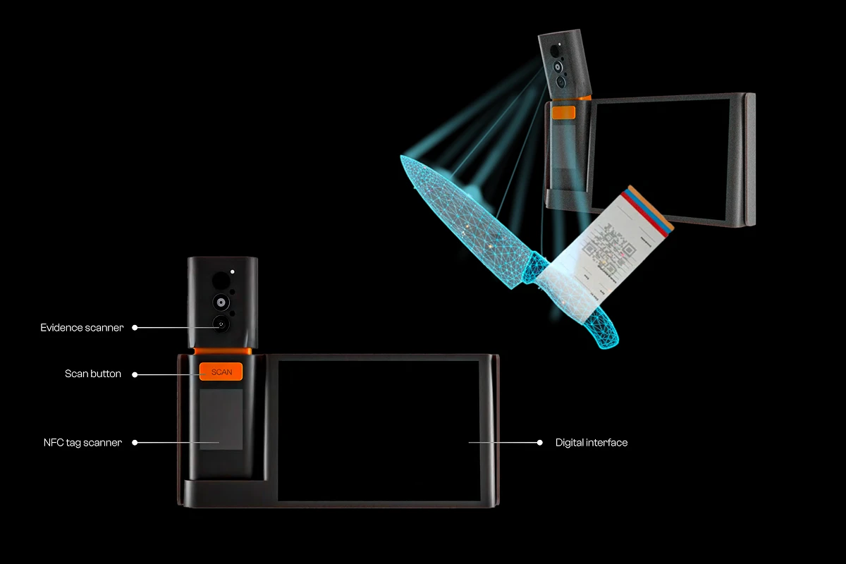
NAYAK is an ecosystem of two devices and an app that protects criminal evidence from the moment it is picked up at a crime scene. NAKSH, a phone add-on, scans evidence through picture, X-ray and thermal lenses and prints an NFC-tagged receipt for it; SAKSH, installed at police stations, forensic labs and courts, reads that tag to log evidence in and out and re-scans it to check whether anything has changed. Together they turn a manual malkhana register into a chain of custody every stakeholder can audit.
What we liked: Arush went and looked. The field research into how evidence actually moves, from crime scene to malkhana to forensic lab to court, is what gives this proposal its authority, and choosing evidence collection as the point of intervention was a sharp call. He mapped the tampering risk at every handoff and then designed against each one, which is a level of rigour we rarely see at this stage. The conceptual maturity here is real.

Industrial Design
Challenge:
Preservation of Truth
Dust Time Capsule is a passive recording device that archives what happens in a room by collecting the dust that settles in it. Installed in council halls, archives and homes, it draws in air and seals each day’s accumulation into a thin, time-stamped layer inside a quartz cylinder, building a stack of strata readable only through physical analysis in a lab. It has no network and no software, so any attempt to alter it leaves a visible scar in the layers.
What we liked: The move from a sci-fi premise about AGI-era forgery to a small glass cylinder sitting quietly in a room was a pleasure to follow, and Ashray’s reasoning held at every step. Grounding dust as a medium in real forensic science kept an imaginative idea believable, and the archival system covered both the experiential and the functional side of the problem. The ethics section, where he draws the line between a truth-keeper and a surveillance device, showed he’d thought well past the concept. The balance he holds between imagination and realism is a rare skill.
Industrial Design
Challenge:
Preservation of Truth
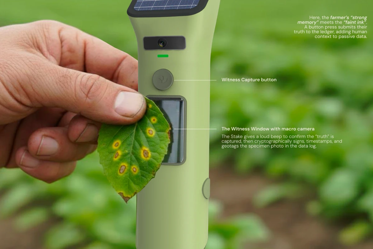
VeriStake is a solar-powered probe planted in a farmer’s field that records what actually happened on that land. It logs soil and weather data on its own, and a press of the witness button lets the farmer add a photographed, timestamped record of their own, each entry cryptographically signed and sent to a village hub for the permanent ledger. When the network drops, the stake detaches and can be carried to the panchayat by hand.
What we liked: The gap Heti found, between a farmer’s lived reality and the official record that overrules it, is a real and urgent one, and she framed it with care. Setting generalised truth against hyper-localised truth was a fresh way into the preservation brief. The detachable stake is a lovely answer to patchy rural connectivity: when the signal drops, the farmer pulls it out and carries the evidence to the panchayat by hand. It sits close enough to existing agri-tech that the whole thing reads as possible rather than hypothetical.
Communication Design
Challenge:
Distribution of Truth
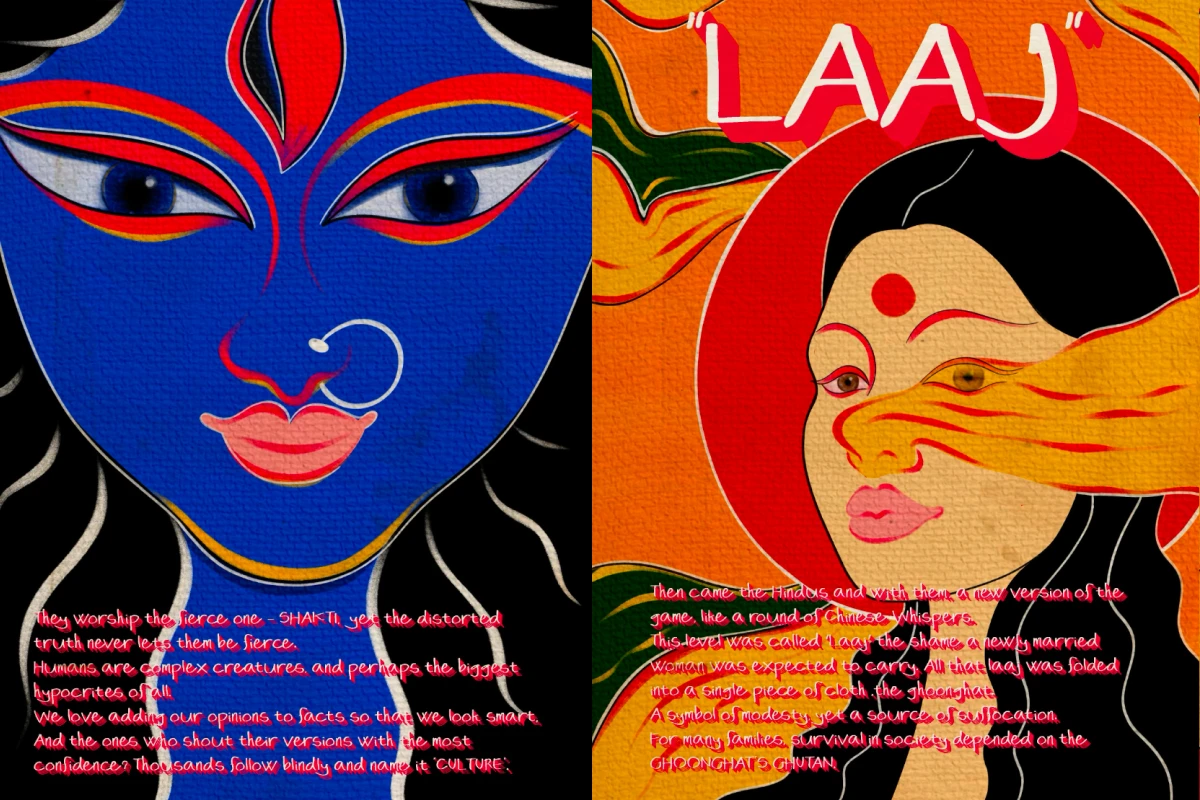
Ghoonghat ya Ghutan? is a zine that traces how one custom, the veil, travelled through centuries of retelling until the distortion became fact. Built on the logic of Chinese Whispers, it moves through surreal spreads and poetic text, shifting colour at each stage to mark another layer of alteration. It closes with the woman unveiled, asking the reader how much of what they accept as culture arrived the same way.
What we liked: Janvi’s research was the strongest part of the submission, comprehensive, curious and genuinely enjoyable to read through. She sat with an open brief and let the insight emerge rather than forcing an answer early, and narrowing distribution down to rumour, then to the amplifier in the chain, gave the work a clear point of entry. Choosing the veil as the case study was a brave call. Shifting the colour stage by stage so each layer of distortion is visible on the page is a lovely piece of thinking.
Communication Design
Challenge:
Interpretation of Truth
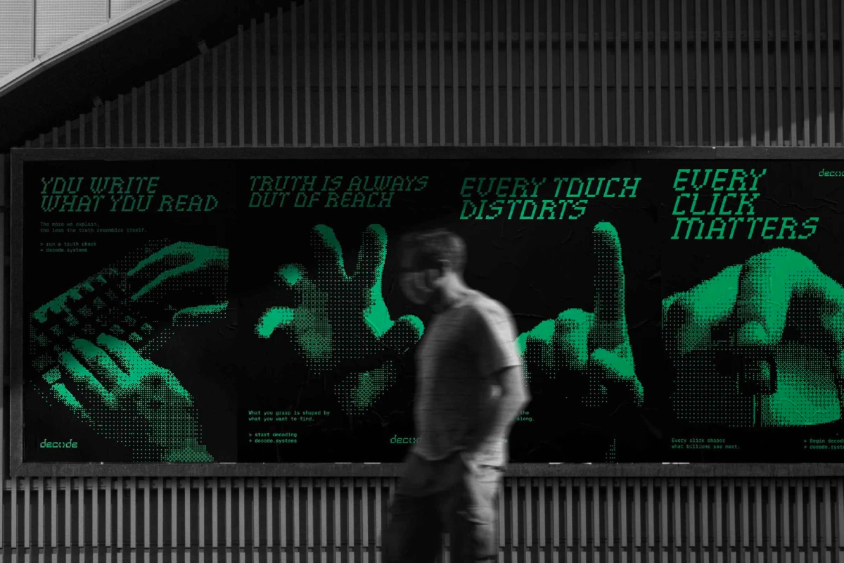
Decode is an educational micro-brand that teaches people how misinformation is built rather than telling them what is false. It works through a terminal-inspired visual system of pixel grids, dithering and forensic-style imagery, applied across posters, zines, stickers, workshops and an app. Instead of fact-checking a claim, it trains the eye to catch the cropping, framing and tinting that make something look true.
What we liked: Kalpak’s read of the brief was sharp: the real problem isn’t misinformation but our inability to decode it, and every part of the brand follows from that one line. The identity is built on solid fundamentals and the bold aesthetic gives it a distinct attitude, which isn’t easy when the subject matter is this clinical. Building it out across posters, zines, stickers, workshops and an app meant the idea had to survive contact with a lot of formats, and it holds in all of them. Work overall was organised and structured.
Communication Design
Challenge:
Preservation of Truth
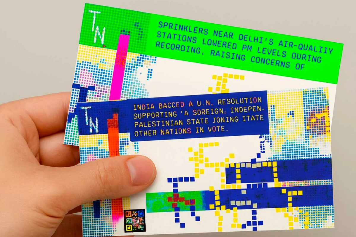
Truth Notes is a speculative currency in which every verified fact is issued as a banknote. Denomination is set by the strength of the evidence behind it, and each note carries the security apparatus of real money: watermarks, microtext, and a QR code holding the full context. It is satire delivered with a straight face, on the logic that if misinformation travels faster than money, truth had better be harder to counterfeit.
What we liked: Turning truth into currency was a bold conceptual leap, and Mugdha’s decision to express it through a form as familiar as a banknote is what made an abstract system legible. The denominations set by evidence strength, the watermarks, the QR code carrying the context the internet strips out: the metaphor holds all the way down into the detail. The visualisation of raw digital information was an intriguing direction, and the writing has real wit.
UI/UX Design
Challenge:
Distribution of Truth
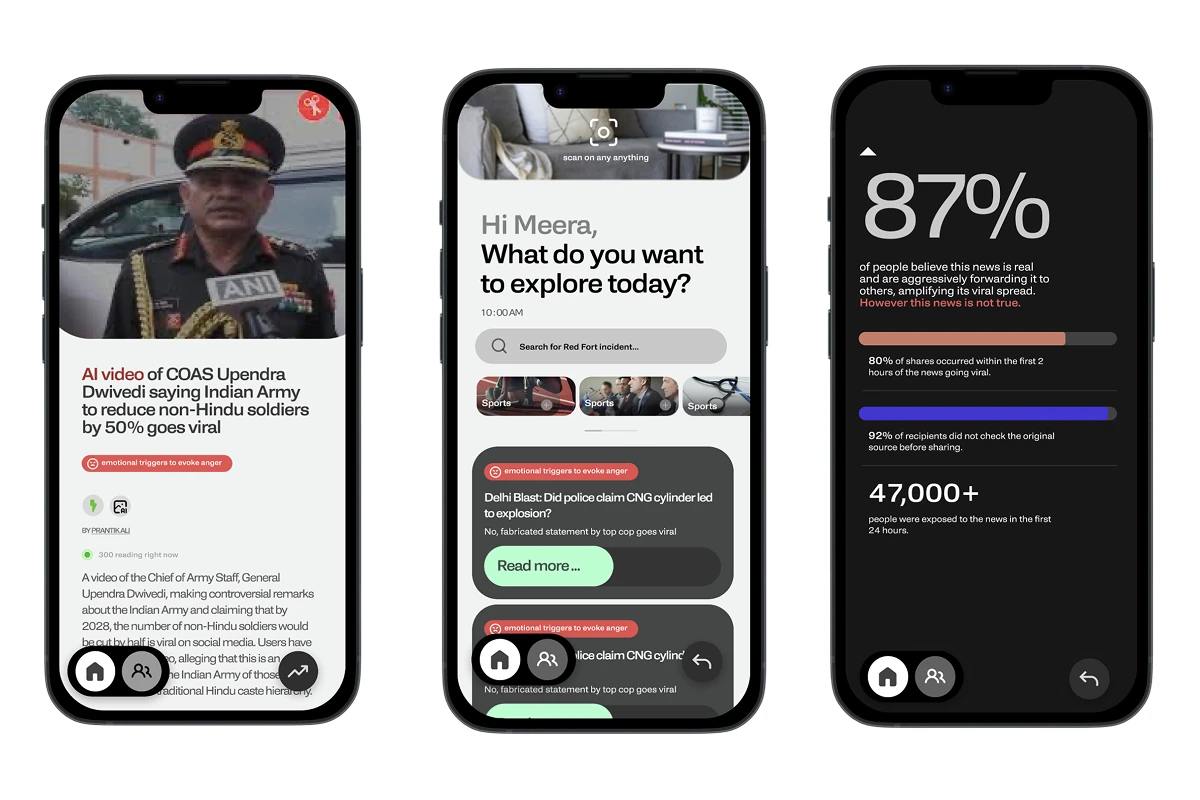
Udti Khabar is an app that shows a news story’s journey rather than only its conclusion. It maps the route a message takes from source to translator to platform to public reaction, marking where distortion enters: a truncated headline, an exaggerated thumbnail, a WhatsApp forward. Built for young readers, it folds verification and short lessons on bias into the feed they are already scrolling.
What we liked: The research was the most alive part of Anika’s submission, twenty-three interviews, a clear-eyed model of how distortion enters at each handoff, and a comfort with ambiguity that let her sit inside the problem rather than rush past it. Breaking the journey into source, translator, platform and public reaction, then naming the friction point at each step, gave her a real map to design against. The phrases and cues she surfaced along the way were a pleasure to read, and the journey through them was engaging from start to finish.
UI/UX Design
Challenge:
Interpretation of Truth
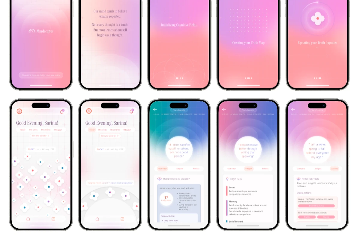
Mindscapes is a speculative interface that turns self-belief into something you can look at. Every recurring thought a person holds about themselves becomes a truth capsule carrying its origin, emotional charge and frequency, arranged in a concentric map readable by day, month or year. Open one and it expands into where the belief came from, what reinforces it, and tools to rephrase it or break the loop.
What we liked: Anusha took the interpretation brief somewhere no one else did, inward, to the truths we build about ourselves through sheer repetition, and the framing was clear enough that the leap felt earned rather than clever. The truth capsule is a well-defined object: its origin, its emotional charge, how often it recurs, what reinforces it and what counters it. She was also honest about which parts of the system are still unresolved, which we appreciated. The direction is refreshingly different from anything else we read.
UI/UX Design
Challenge:
Interpretation of Truth
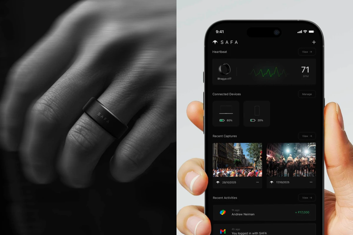
SAFA is a ring and an app that use a heartbeat to prove a person is human. The ring reads blood-flow patterns through an optical sensor, builds an encrypted Bio-ID from the rhythm unique to its wearer, and keeps it on a secure chip that never shares it. Anything captured through the SAFA app while the ring is worn carries a verified badge, so a post can be traced to a living person rather than a bot or a model.
What we liked: Bhagya’s lens on the brief was unusual: instead of asking whether a piece of content is true, ask whether a human made it, and the pain journey mapping made a clear case for why platform verification falls short today. The answer she landed on, a heartbeat read through an optical sensor and sealed into an encrypted Bio-ID that never leaves the chip, is a neat piece of resolution. The presentation was clean and the visualisations were done well.
UI/UX Design
Challenge:
Interpretation of Truth
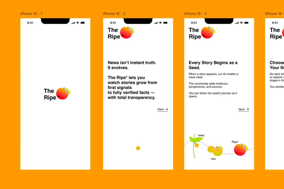
*The Ripe is a community-driven news app in which a story has to ripen before it counts as verified. Each breaking story enters as a seed compiled by AI from early signals, readers add evidence and argument to grow it from raw to ripe, and neutral journalists and subject experts fact-check it before it earns that status. Readers can browse only ripe news or watch stories develop in the Garden, where every change to the record stays visible on a timeline.
What we liked: Radhika reframed the brief in a way that stayed with us: the problem may not be that truth is hard to find but that we don’t much want it, which led to a far more interesting question about making the wait for truth feel better than the hit of instant misinformation. The iceberg model gave the research real structure, separating what people see at the surface from the patterns and mental models underneath. The seed-to-ripe metaphor then carries the whole product without strain, right down to the Garden feed and the timeline that stays visible on every story.
Designing for Authenticity in the Post-Truth Era
- Explore the intersection of ethics, technology and storytelling.
- Critically think about how truth feels and endures in the 21st century.
- Propose products, prototypes and provocations that re-anchor us to reality.