Brand Design for Medical Implants
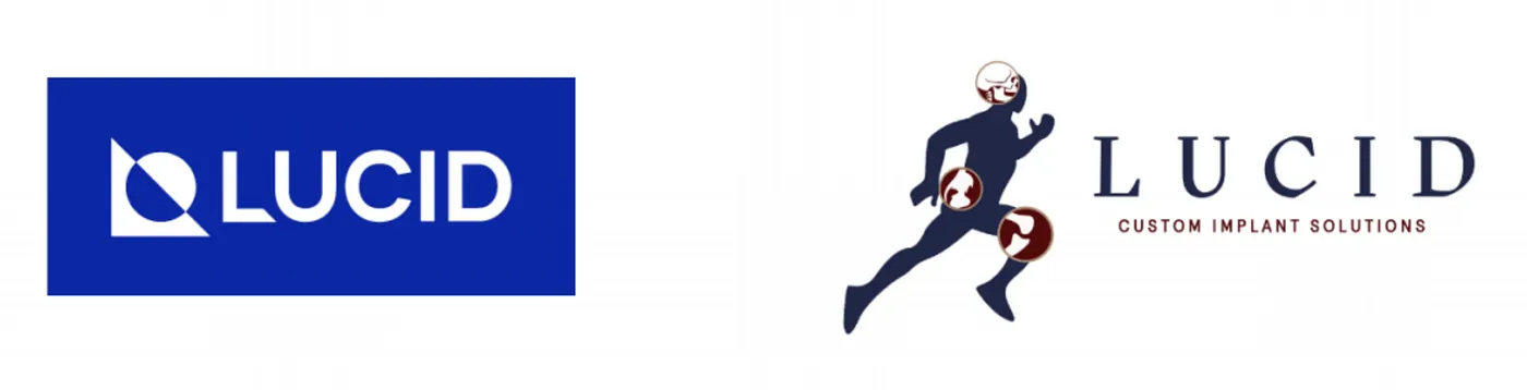
Lucid is a medical technology company that provides affordable 3D printed custom implants for reconstruction surgeries. The company born 2018, has a Vision to become the most trusted and connected brand in facial reconstruction surgery in India and the world.
The team of Lucid reached out to Studio Carbon two months ago, to design Brand Identifiers for the company that communicated a strong presence and an emphatic brand story. The sector, vision and values of Lucid of course excited us to take up the project. But what excited us the most was their team working at the intersection of medicine, technology and business. The only missing piece in their team was design, and we eagerly hopped on to fill that gap :)
The team’s expectations from the Brand design was a minimal visual language, all identifiers successfully tied up together. The next 6 weeks realised these expectations into Lucid’s logo, colour system and graphic elements.
Logo
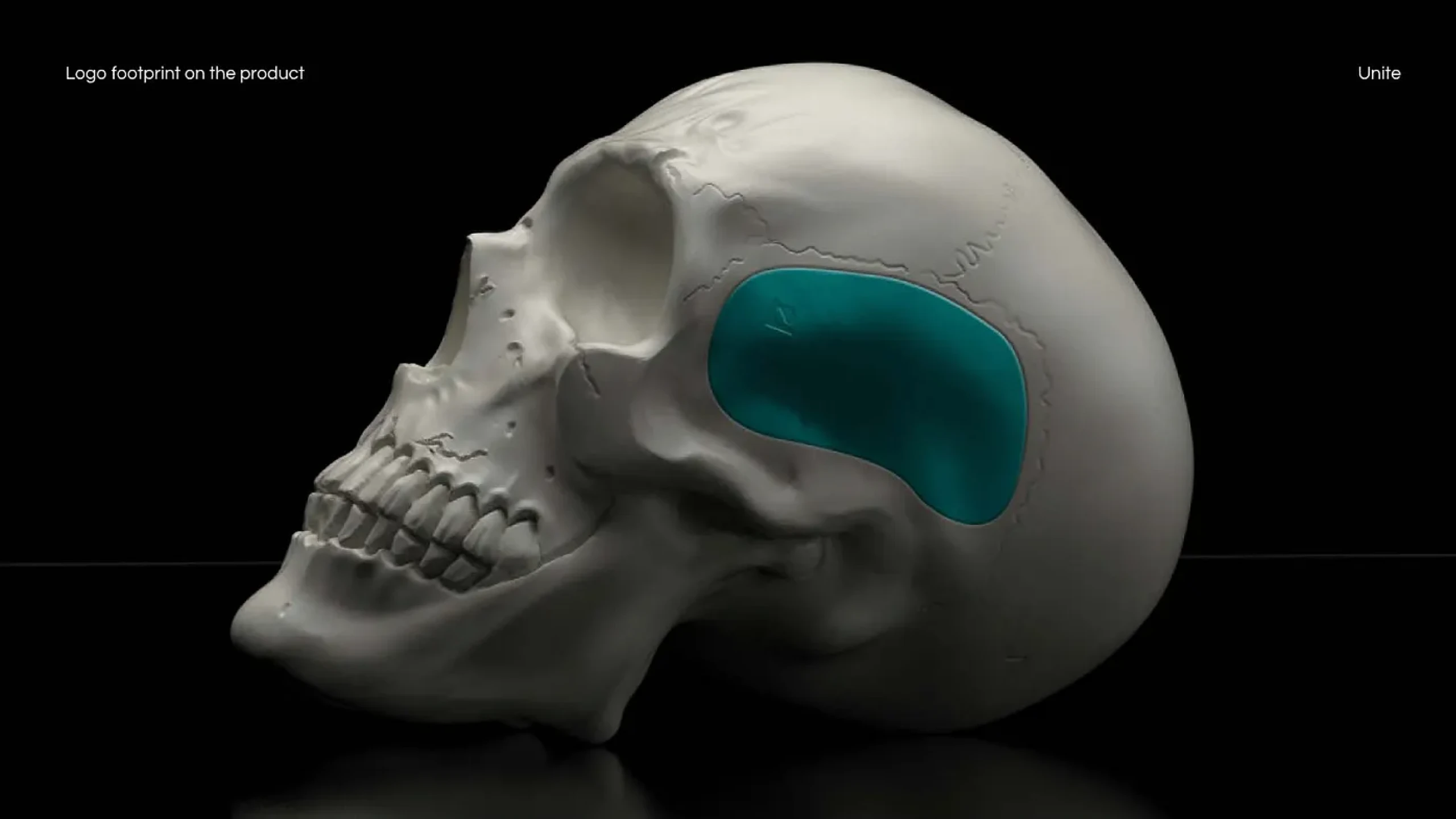
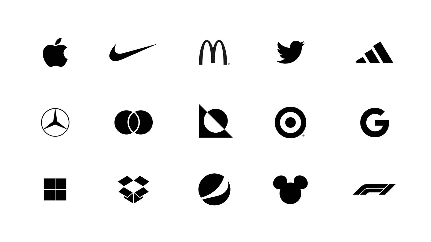
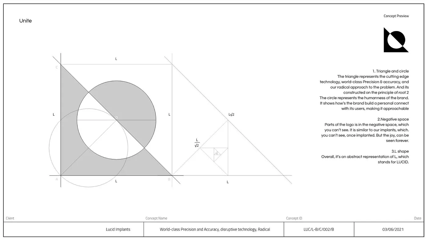
The biggest challenge in the logo was to design something that is minimal, abstract and yet has a direct correlation with the business and values of Lucid. After 130 unique logo ideations by 3 designers, narrowed down to 5 promising ideas, and finally shortlisted to this logo that we call “Unite”!
Constructed using three primary shapes of a square, triangle and circle the logo brings together the three verticals of Lucid through abstraction. The triangle represents cutting edge technology and world class precision. The circle communicates the brand’s humanness and approachable nature to the users. The square formed by the negative space represents the implants constructed by Lucid, that are invisible after surgery keeping only the joy.
Logo Trivia: The triangle also embodies L, primary alphabet for the brand. And it’s been constructed on the mathematical ration of √2.
Secondary Identifier | Colour System
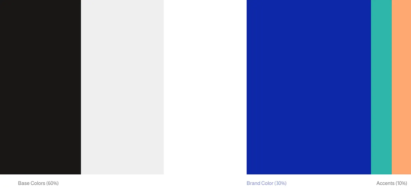
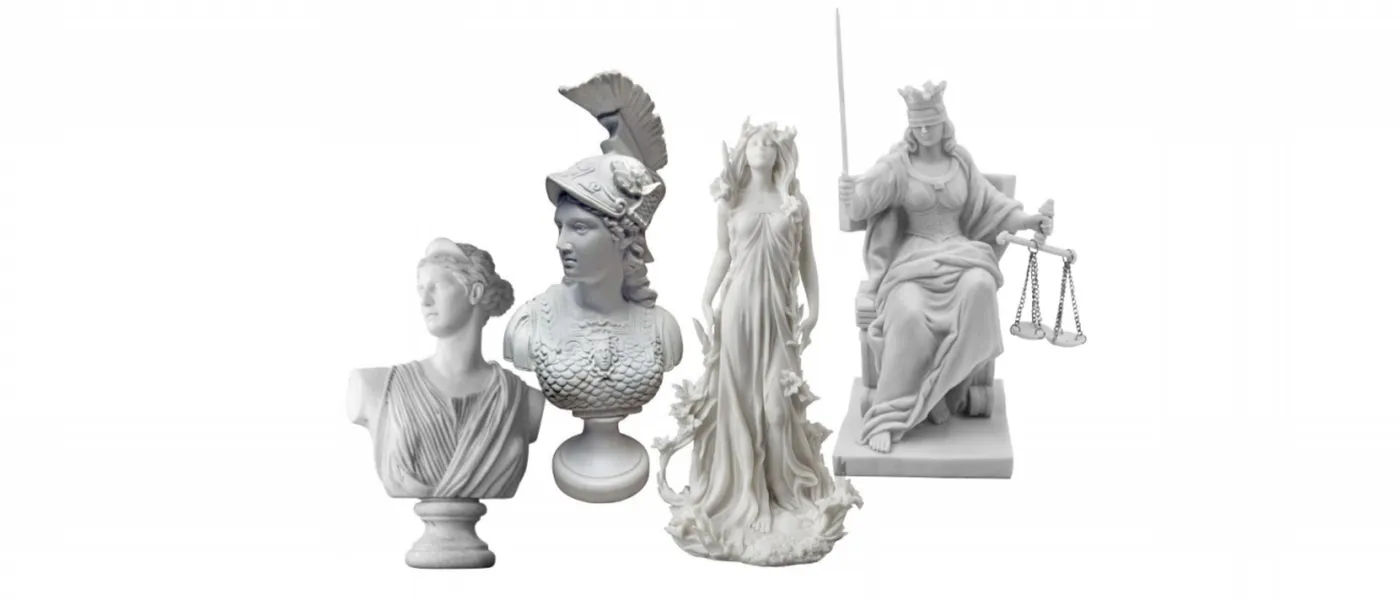
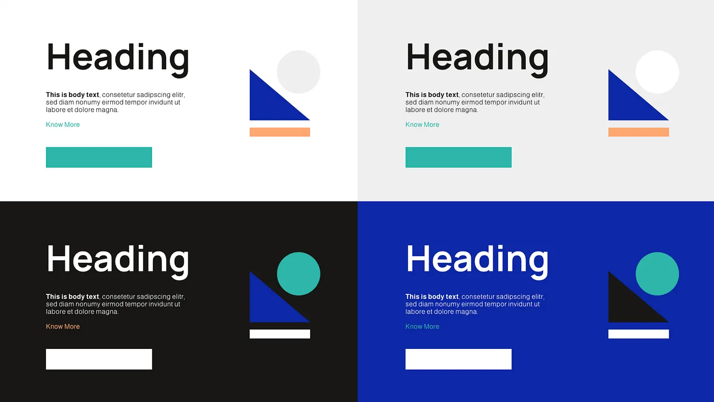
With the discovery of medicine attributed to the ancient Roman world, it was only apt for us to develop a Colour system inspired from Roman Gods. The final colour palette of Lucid is a mix of a primary brand colour(Minerva Blue), a range of neutrals and two accent colours(surgeon green and lively orange).
Press enter or click to view image in full size
Minerva blue is inspired from Goddess Minerva. She is a goddess highly revered, honoured and respected as the fore-bearer of medicine and technology. Akin to it’s namesake, Minerva blue denoted the bold, professional and reliable offerings of Lucid in the field of technology and medicine.
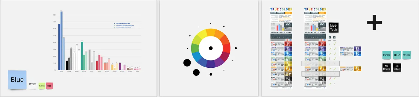
Shortlisting of the colour system of Lucid was a very comprehensive activity. Not only did we set out to seek inspiration from the ancient world of Roman gods, we also studied the current world of the Medical industry. Colour trends study of over 100 companies, colour association research for the medical industry and colour terminologies of the industry helped us build a colour system that was familiar to the sector yet unique from its competitors.
A synesthesia activity to integrate associations with the name Lucid, the attributed of the logo and the company’s brand values was the highlight of this phase.
Graphic Elements
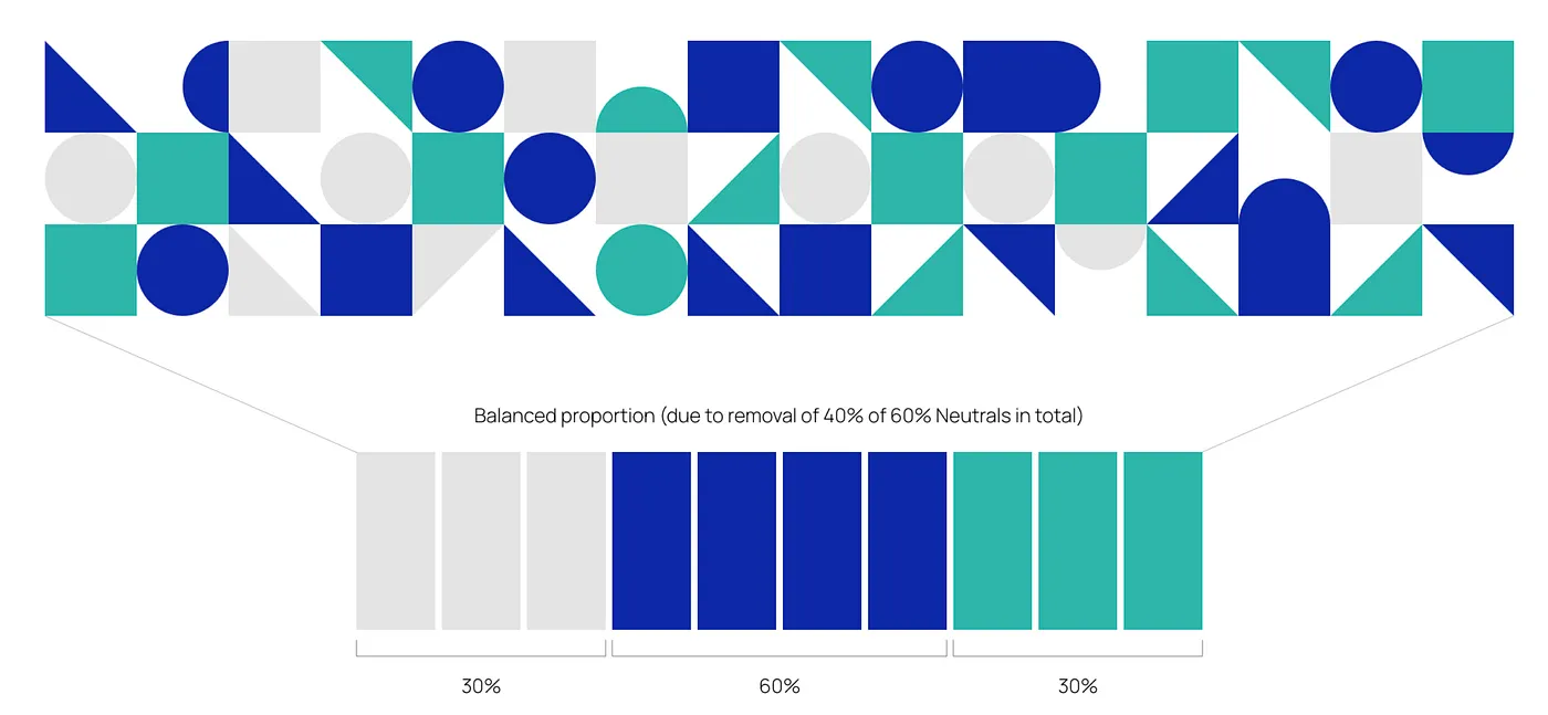
The Graphic elements have been constructed with the logo sections of a square, triangle and circle as well as with a mix of the brand’s colour. The graphic elements help tie the entire brand together.
Reflections
In our journey of 3 years, we’ve developed over 10 brand systems for some very inspiring clients across industries. Yet the brand design project with Lucid is a flagship project for us on what our a successful and engaging design-industry partnership looks like.
Here are some key takeaways from this collaborative effort of Brand Design
- Eagerness to educate yourself in the sector and educating the client in design is essential for design of an honest solution
- Co-creation between us(designers), clients and end customers ensures each stakeholder’s Vision is realised in the design
- Synthesis of research and insights is the phase of design in which unlikely insights emerge and magic happens
- Rigour of iterations has no substitute. Period!